
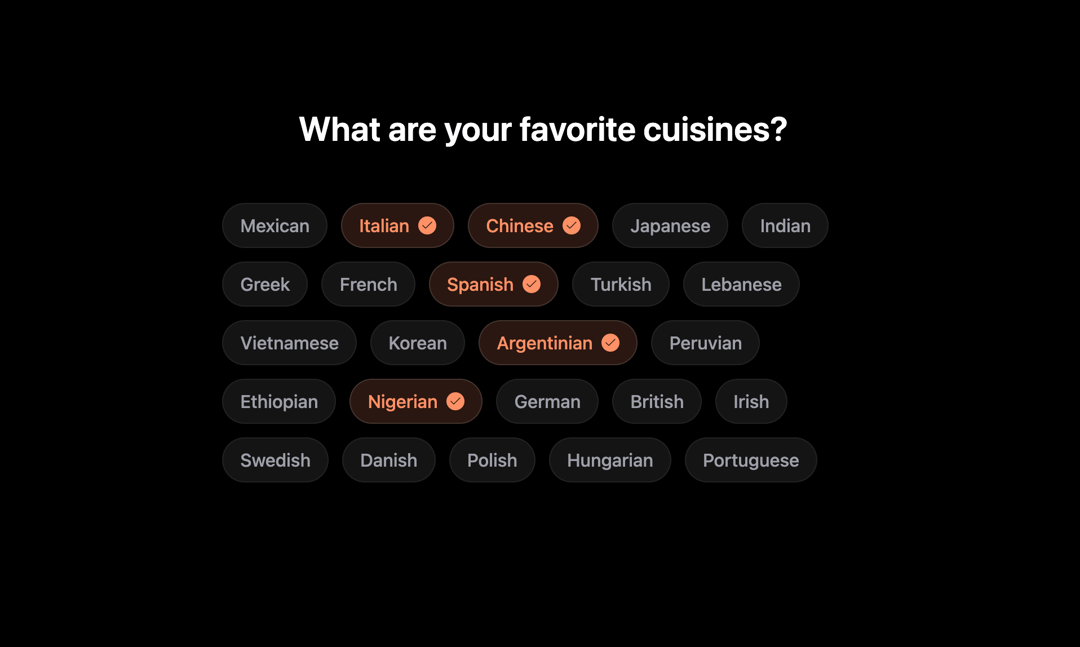
This code implements an interactive cuisine selector component. It allows users to select multiple cuisines from a predefined list. The component utilizes a functional approach, leveraging React's useState hook for managing selected items. The core functionality involves toggling the selection state of each cuisine when a button is clicked. The component dynamically updates the UI to reflect the user's choices. It enhances user experience with smooth animations and visual feedback powered by Framer Motion. The visual style includes a checkmark that appears when a cuisine is selected, smoothly animating in and out. The styling uses a dark theme and is responsive. The component addresses the need for a user-friendly and visually appealing way to allow users to select multiple options from a list, particularly useful in applications like food delivery apps, recipe websites, or preference settings. The component iterates through a predefined array of cuisines, creating a button for each. Each button uses Framer Motion's animation capabilities for hover, tap, and selection state changes, providing smooth visual feedback. The selected cuisines are stored in an array managed by the useState hook. The toggleCuisine function updates this array, adding or removing cuisines based on user interaction. The Check icon from the lucide-react library is used to visually indicate selected cuisines. The component's animations are carefully configured to ensure a smooth and engaging user experience. It can be applied in various scenarios, such as filtering options, preference settings, or interactive forms where multiple selections are required. For example, a food delivery app could use this component to let users select their preferred cuisines, a recipe website might use it to filter recipes, or a survey could use it to allow multiple-choice answers.
Built with React and Tailwind. Copy the prompt and paste it into Claude Code, Cursor or Lovable: your agent adds Cuisine Selector Chips to your project and fits it to your theme.
Code
How Cuisine Selector Chips is used: the demo's code. The component's own source comes with a free account.
Usage.tsx
import CuisineSelector from "@/components/ui/cuisine-selector-chips";

export default function DemoOne() {
  return <CuisineSelector />;
}
Dependencies
More by Sonu kumar
View all
Dashboard with Collapsible Sidebar
2.4K
Modern Hero
1.4K
Text Parallax Content (scroll)
1.2K
About Us section
1.2K
Modern Animated Hero Section
1.1K
Animated Hero Section
689
Bounce card features
573
Futurastic Hero Section
485