
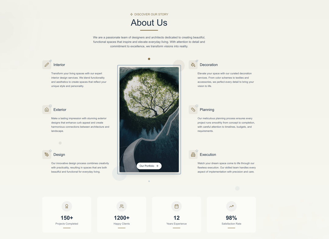
This component is ideal for an "About Us" or "Services" section on a company website, particularly for businesses in design, architecture, or related creative fields. It provides a modern, engaging, and informative presentation of the company's capabilities and achievements. Key Features: Responsive Layout: The component adapts its layout for different screen sizes, arranging content in a single column on small screens and a multi-column grid on larger ones. Parallax Background Elements: Decorative circular elements in the background move and rotate subtly based on scroll position, adding depth and visual interest. "About Us" Header: A clear and concise "About Us" heading is accompanied by a subtitle and an animated underline, effectively introducing the section. Company Introduction: A central paragraph provides a brief overview of the company's mission and values. Service Offerings: Six distinct service items (Interior, Exterior, Design, Decoration, Planning, Execution) are displayed. Each service includes an icon, a title, and a description. Services are strategically placed in left and right columns, flanking a central image. The ServiceItem sub-component features hover animations for icons and titles, along with a "Learn more" link that appears on hover. Central Image with Call to Action: A prominent image (Modern House) serves as a visual anchor. It features a subtle border animation, floating accent elements, and an overlaid "Our Portfolio" button that appears on hover. Animated Statistics (StatCounter): Four key statistics (Projects Completed, Happy Clients, Years Experience, Satisfaction Rate) are displayed with an animated counter format. The StatCounter sub-component uses framer-motion's useSpring and useTransform to animate numerical values as they come into view. Each stat includes an icon, a numerical value with a suffix, and a descriptive label, along with hover effects for the icon and a line underneath. Call to Action (CTA) Section: A clear and inviting call-to-action at the bottom prompts users to "Get Started" and encourages them to transform their space. Framer Motion Integration: The component heavily uses framer-motion for: Orchestrated Entrance Animations: Elements fade in and slide up or across as the section comes into view. Hover Effects: Interactive animations on service items, the central image button, and stat counters. Parallax Scrolling: Dynamic movement of background and accent elements based on scroll. Spring Animations: Smooth counting animation for statistics. Modular Design: The section is composed of reusable sub-components (ServiceItem and StatCounter), promoting organized and reusable code. The AboutUsSection component presents key information about a company—likely an interior design or architectural firm—through a combination of text, service listings, an engaging image, and animated statistics. It's built with a focus on modern aesthetics and user experience, incorporating subtle animations and parallax effects to create an immersive feel.
Built with React and Tailwind. Copy the prompt and paste it into Claude Code, Cursor or Lovable: your agent adds About Us section to your project and fits it to your theme.
Code
How About Us section is used: the demo's code. The component's own source comes with a free account.
Usage.tsx
import AboutUsSection from "@/components/ui/about-us-section";

const DemoOne = () => {
  return <AboutUsSection />;
};

export { DemoOne };
Dependencies
More by Sonu kumar
View all
Dashboard with Collapsible Sidebar
2.4K
Modern Hero
1.4K
Text Parallax Content (scroll)
1.2K
Modern Animated Hero Section
1.1K
Animated Hero Section
689
Cuisine Selector Chips
585
Bounce card features
573
Futurastic Hero Section
485
More in Cards
View all
Stats cards with links
33

Course Design Cards
1.1K

Card
70
Statistics Card 2
264
Statistics Card 10
263

Card
17

Card Studio
9
The Item one
3
