
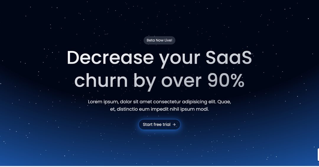
AuroraHero: Dynamic Gradient & Starfield Hero Section Captivate your audience from the moment they land on your page with AuroraHero, a stunning and interactive hero component for React. This component combines a mesmerizing, animated radial gradient background with a subtle, shimmering starfield, creating an immersive and modern visual experience that grabs attention. Features Animated Aurora Gradient: The background features a beautiful radial gradient that smoothly transitions through a predefined palette of colors, creating a dynamic "aurora" effect that adds depth and visual interest. This animation is handled seamlessly by Framer Motion. Subtle Starfield Background: A captivating 3D starfield, powered by React Three Fiber and Drei, provides a subtle yet engaging backdrop, enhancing the cosmic and futuristic feel of the component. Engaging Call to Action: A prominent headline and descriptive text are accompanied by a call-to-action button that dynamically changes its border and box-shadow color to match the animating background gradient. The button also includes subtle hover and tap animations for improved user feedback. Responsive Design: The component is built with responsiveness in mind, ensuring it looks fantastic and performs well on various screen sizes. How it Works AuroraHero leverages the power of: Framer Motion: For all the fluid animations, including the color transition of the background gradient, button border, and box-shadow. useMotionValue and useMotionTemplate are key here, linking the dynamic color to various CSS properties. React Three Fiber & Drei: For rendering the performant and visually appealing 3D starfield, adding an extra layer of polish to the hero section. This component is ideal for SaaS landing pages, product showcases, or any website where you want to make a bold, modern, and memorable first impression. Its elegant animations and engaging visuals are sure to leave a lasting impact on your visitors.
Built with React and Tailwind. Copy the prompt and paste it into Claude Code, Cursor or Lovable: your agent adds Futurastic Hero Section to your project and fits it to your theme.
Code
How Futurastic Hero Section is used: the demo's code. The component's own source comes with a free account.
Usage.tsx
import { AuroraHero } from "@/components/ui/futurastic-hero-section";

const Main = () => {
  return (
    <div className="w-full">
    <AuroraHero />
    </div>
    );
};

export { Main };
Dependencies
More by Sonu kumar
View all
Dashboard with Collapsible Sidebar
2.4K
Modern Hero
1.4K
Text Parallax Content (scroll)
1.2K
About Us section
1.2K
Modern Animated Hero Section
1.1K
Animated Hero Section
689
Cuisine Selector Chips
585
Bounce card features
573
More in Heroes
View all

SaaS Template
2.4K

Responsive Hero Banner
2K

Hero
1.2K
Centered Hero with Image Fan
931
Editorial Collage Hero
430
Glass Fold
212

Minimalist Hero Fashion
285

HeroSectionWithGradient
336
