
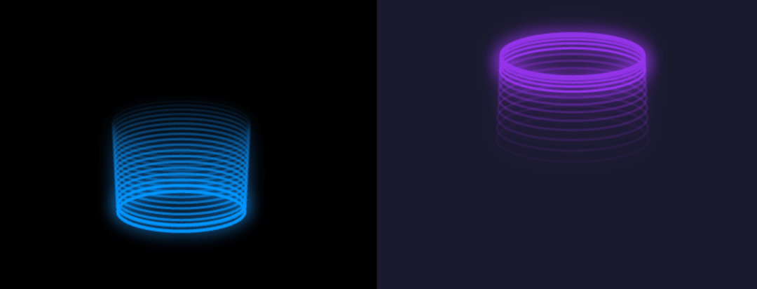
Responsive: Automatically resizes with container Performance: Proper cleanup of animation frames and event listeners Customizable: All visual parameters are configurable via props Reusable: Can be easily imported and used in any React app Multiple instances: The example shows two different configurations side by side // Basic usage <GlowingBouncingRing /> // Custom configuration <GlowingBouncingRing ringColor="rgba(255, 0, 150, 1)" bounceHeight={250} speed={0.03} />
Built with React and Tailwind. Copy the prompt and paste it into Claude Code, Cursor or Lovable: your agent adds Glowing Boucing Ring to your project and fits it to your theme.
Code
How Glowing Boucing Ring is used: the demo's code. The component's own source comes with a free account.
Usage.tsx
import GlowingBouncingRing from "@/components/ui/glowing-boucing-ring";

export default function DemoOne() {
  return <div className="w-full h-screen bg-black">
      <div className="grid grid-cols-1 md:grid-cols-2 h-full">
        {/* Default blue ring */}
        <div className="h-full">
          <GlowingBouncingRing />
        </div>

        {/* Custom purple ring */}
        <div className="h-full">
          <GlowingBouncingRing
            ringColor="rgba(147, 51, 234, 1)"
            shadowColor="rgba(147, 51, 234, 0.8)"
            backgroundColor="#1a1a2e"
            bounceHeight={200}
            speed={0.08}
            ringWidth={100}
            ringHeight={30}
          />
        </div>
      </div>
    </div>;
}
More by Sonu kumar
View all
Dashboard with Collapsible Sidebar
2.4K
Modern Hero
1.4K
Text Parallax Content (scroll)
1.2K
About Us section
1.2K
Modern Animated Hero Section
1.1K
Animated Hero Section
689
Cuisine Selector Chips
585
Bounce card features
573