
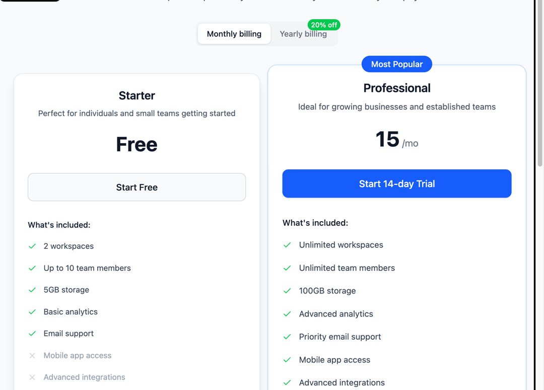
This modern, responsive Pricing Cards component is built using React, Tailwind CSS, and Lucide Icons. It features a clean and intuitive UI, ideal for SaaS products or service-based websites. It supports: Three pricing tiers: Starter, Professional, Enterprise. Billing cycle toggle for monthly/yearly pricing with a discount badge. Feature comparison with check/cross icons. A “Most Popular” badge for highlighting plans. Fully responsive grid layout. A promotional section with key platform guarantees (Security, Uptime, Support). Built with accessibility and performance in mind. It’s customizable, easy to integrate into any React/Next.js project, and uses semantic HTML and best practices for UI structure. Technologies Used: React Tailwind CSS Lucide React Icons Ideal For: SaaS platforms Startups Business websites with tiered pricing models File Type: React Component (.tsx or .jsx)
Built with React and Tailwind. Copy the prompt and paste it into Claude Code, Cursor or Lovable: your agent adds Modern Pricing Section to your project and fits it to your theme.
Code
How Modern Pricing Section is used: the demo's code. The component's own source comes with a free account.
Usage.tsx
import ModernPricingCards from "@/components/ui/modern-pricing-section";

export default function DemoOne() {
  return <ModernPricingCards />;
}
Dependencies
More by Sonu kumar
View all
Dashboard with Collapsible Sidebar
2.4K
Modern Hero
1.4K
Text Parallax Content (scroll)
1.2K
About Us section
1.2K
Modern Animated Hero Section
1.1K
Animated Hero Section
689
Cuisine Selector Chips
585
Bounce card features
573
More in Pricing
View all
Pricing Section
582

Pricing Cards
31

Pricing Card
535

Pricing Section
173
pricing section
158
Single Pricing Card
795

Pricing
125
Glowing Pricing Tiers
45


