
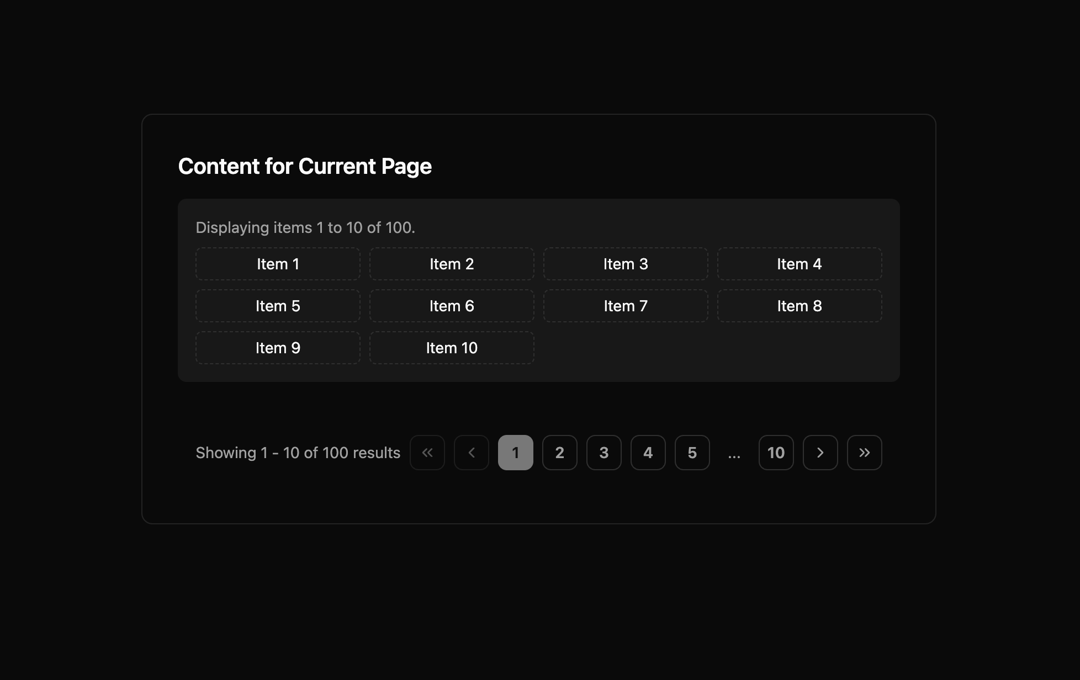
Stop shipping clunky pagination. This drop-in React + shadcn/ui pagination component gives you enterprise-grade accessibility, responsive design, and dark mode support out of the box. Fully customizable, lightweight, and built for production at scale — because your users deserve better navigation.” ⚡ Why this works: Title is punchy, modern, and developer-friendly (“Next-Gen”, “Shadcn-ready” trigger interest). Description highlights pain points (clunky pagination) and the solution (accessible, responsive, production-ready). Uses action words: “Stop”, “drop-in”, “built for production” → this makes developers feel it’s urgent and useful.
Built with React and Tailwind. Copy the prompt and paste it into Claude Code, Cursor or Lovable: your agent adds Next-Gen Pagination: Accessible to your project and fits it to your theme.
Code
How Next-Gen Pagination: Accessible is used: the demo's code. The component's own source comes with a free account.
Usage.tsx
import ExampleUsage from "@/components/ui/next-gen-pagination-accessible";

export default function DemoOne() {
  return <ExampleUsage />;
}
Dependencies
More by Sonu kumar
View all
Dashboard with Collapsible Sidebar
2.4K
Modern Hero
1.4K
Text Parallax Content (scroll)
1.2K
About Us section
1.2K
Modern Animated Hero Section
1.1K
Animated Hero Section
689
Cuisine Selector Chips
585
Bounce card features
571
More in Navigation
View all

Sidebar
229

Tabs
60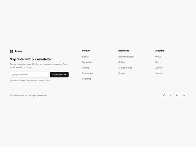
Newsletter Signup Footer
15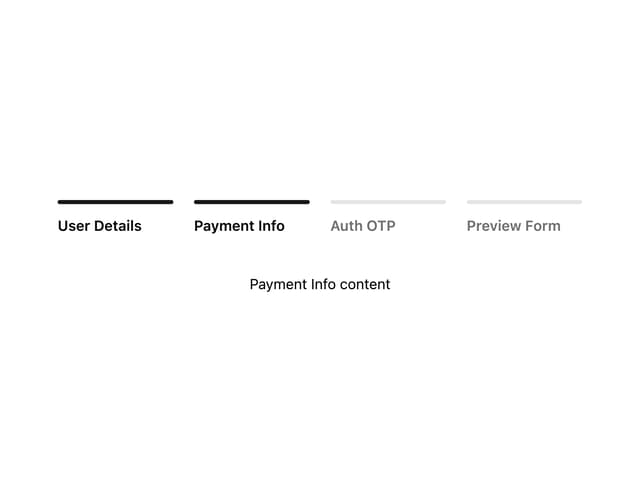
Progress Bar Stepper
36
Navbar with Theme Toggle
43

Footer 2
200
Numberless Pagination with Text
11

Navbar
71
