
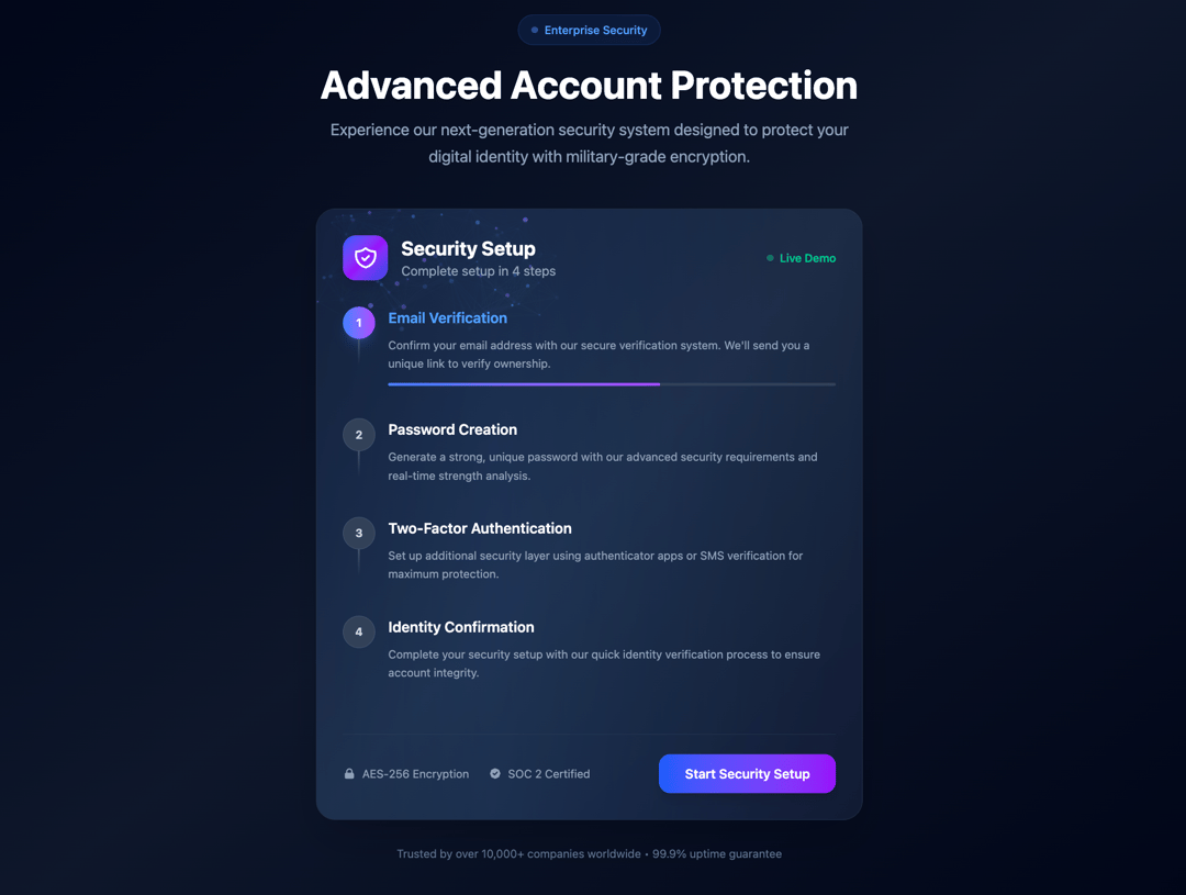
Next Gen Security Card The NextGenSecurityCard component is a visually immersive, interactive experience that guides users through a secure, multi-step account protection process with elegance and clarity. Designed with a strong emphasis on modern UI principles, it leverages advanced animations from Framer Motion, subtle particle effects, and a dynamic spotlight to create a highly engaging interface. The component introduces four progressive security steps—Email Verification, Password Creation, Two-Factor Authentication, and Identity Confirmation—each represented with animated indicators and glowing transitions that enhance the sense of progression and user achievement. Real-time feedback is delivered through animated checkmarks and color transitions to reinforce the user’s movement through each stage. A central card acts as the main visual focus, featuring a blend of gradient backgrounds, glowing borders, and a pulsating canvas of particles that respond to user interaction. The design is wrapped in a polished, accessible layout with a clean call-to-action, making the security setup both functional and delightful. With visual cues that signal trust, strength, and protection—such as AES-256 encryption badges and SOC 2 certification icons—this component not only communicates technological sophistication but also instills user confidence. Perfect for enterprise platforms or modern SaaS applications, NextGenSecurityCard exemplifies the next generation of onboarding and security user experience.
Built with React and Tailwind. Copy the prompt and paste it into Claude Code, Cursor or Lovable: your agent adds Next Gen SecurityC ard to your project and fits it to your theme.
Code
How Next Gen SecurityC ard is used: the demo's code. The component's own source comes with a free account.
Usage.tsx
import NextGenSecurityCard from "@/components/ui/next-gen-security-c-ard";

export default function DemoOne() {
  return <NextGenSecurityCard />;
}
Dependencies
More by Sonu kumar
View all
Dashboard with Collapsible Sidebar
2.4K
Modern Hero
1.4K
Text Parallax Content (scroll)
1.2K
About Us section
1.2K
Modern Animated Hero Section
1.1K
Animated Hero Section
688
Cuisine Selector Chips
584
Bounce card features
571