
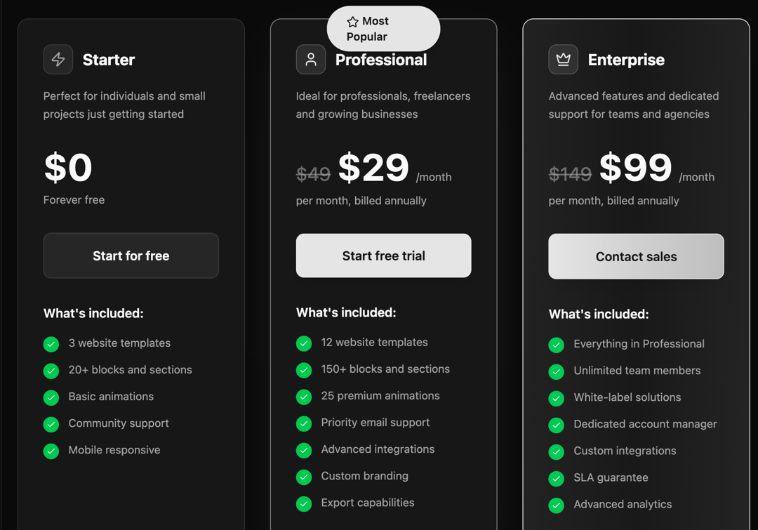
This React component generates a visually appealing and interactive pricing table. It addresses the common need to present different subscription plans with clear pricing and feature comparisons. The component dynamically renders pricing cards based on provided plan data, allowing for easy customization and scalability. Each card displays the plan name, icon, description, price (with optional original price and savings), a call-to-action (CTA) button, and a list of included features. Users can toggle between monthly and annual billing options, impacting the displayed prices accordingly. The component leverages functional components and hooks (useState) for managing state, and utilizes the Lucide React icon library for visual elements. It also incorporates styling for a visually engaging presentation, including background decorations, hover effects, and plan-specific styling variations (basic, popular, premium). This component can be used in various scenarios, such as SaaS product websites, e-commerce platforms, and any application needing to display pricing information for different plans or services. For example, a software company can use this component to showcase its pricing tiers, highlighting the key features and benefits of each. A developer can easily customize the plan data, styling, and CTA links to match their specific requirements. The component is designed to be easily integrated into existing React applications and is highly customizable, making it a versatile solution for displaying pricing information.
Built with React and Tailwind. Copy the prompt and paste it into Claude Code, Cursor or Lovable: your agent adds Pricing Cards Component to your project and fits it to your theme.
Code
How Pricing Cards Component is used: the demo's code. The component's own source comes with a free account.
Usage.tsx
import Pricing from "@/components/ui/pricing-cards-component";

export default function DemoOne() {
  return <Pricing />;
}
Dependencies
More by Sonu kumar
View all
Dashboard with Collapsible Sidebar
2.4K
Modern Hero
1.4K
Text Parallax Content (scroll)
1.2K
About Us section
1.2K
Modern Animated Hero Section
1.1K
Animated Hero Section
689
Cuisine Selector Chips
585
Bounce card features
573
More in Pricing
View all
Pricing Section
582

Pricing Cards
31

Pricing Card
535

Pricing Section
173
pricing section
158
Single Pricing Card
795

Pricing
125
Glowing Pricing Tiers
45


