
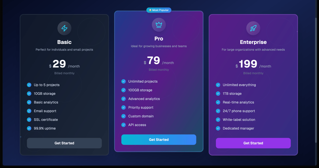
Futuristic Multi-Tier Pricing Cards — Sleek UI Built with React + Tailwind + Lucide This next-gen pricing component combines aesthetic gradients, smooth animations, and highly interactive UX to help your SaaS or product landing page stand out. Built using React, Tailwind CSS, and Lucide Icons, this component delivers premium visuals with clean, modular code. ⚡️ Key Features: Three fully customizable pricing tiers: Basic, Pro (with Most Popular badge), and Enterprise. Gradient-rich card backgrounds with dynamic hover effects and glowing outlines. Animated feature reveal: Features fade in with delay on hover for premium interactivity. Interactive CTA buttons with shine transitions and responsive hover scaling. Reusable Badge and Button components with styling variants for flexibility. Pulsating background elements for added depth and motion aesthetics. 🧠 Tech Stack: React (functional components, hooks) Tailwind CSS (utility-first, responsive styling) Lucide Icons (Zap, Crown, Rocket, Check) Custom animations (fade-in, hover scale, background pulses) 🔧 Ideal For: SaaS landing pages Product pricing sections Startup websites Design-driven marketing pages 🎨 Customization: Each plan card accepts props like: gradient – Tailwind-based gradient background accent – Border color for highlights and glow icon – Icon to represent the tier features, price, period – Full flexibility
Built with React and Tailwind. Copy the prompt and paste it into Claude Code, Cursor or Lovable: your agent adds Pricing Section to your project and fits it to your theme.
Code
How Pricing Section is used: the demo's code. The component's own source comes with a free account.
Usage.tsx
import Component from "@/components/ui/pricing-section";

export default function DemoOne() {
  return <Component />;
}
Dependencies
More by Sonu kumar
View all
Dashboard with Collapsible Sidebar
2.4K
Modern Hero
1.4K
Text Parallax Content (scroll)
1.2K
About Us section
1.2K
Modern Animated Hero Section
1.1K
Animated Hero Section
689
Cuisine Selector Chips
585
Bounce card features
573
More in Pricing
View all
Pricing Section
582

Pricing Cards
31

Pricing Card
535

Pricing Section
173
pricing section
158
Single Pricing Card
795

Pricing
125
Glowing Pricing Tiers
45


