
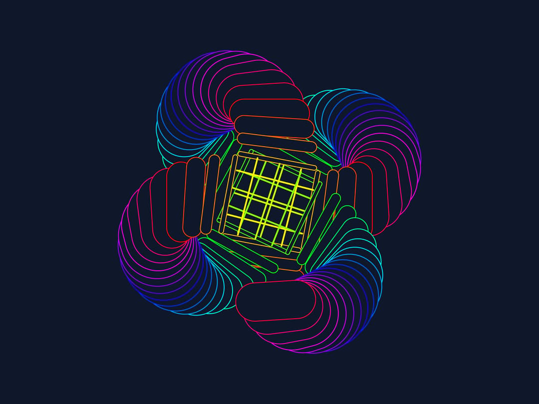
Features: Fully customizable props: count: Number of animated circles (default: 100) size: Size in vmin units (default: 80) duration: Animation duration in seconds (default: 4) hue: Base hue for color rotation (default: 240) className: Additional CSS classes for styling Responsive design: Uses vmin units to maintain proportions across different screen sizes Performance optimized: Uses CSS custom properties and hardware-accelerated transforms Tailwind integration: Uses Tailwind classes where possible while maintaining the complex CSS animations Key Changes: Component structure: Created a reusable RadialAnimation component with props Tailwind classes: Used Tailwind for layout (flex, items-center, justify-center, etc.) and colors (bg-slate-900) Dynamic generation: Uses Array.from() to generate the circles programmatically
Built with React and Tailwind. Copy the prompt and paste it into Claude Code, Cursor or Lovable: your agent adds Radial Animated Doodle to your project and fits it to your theme.
Code
How Radial Animated Doodle is used: the demo's code. The component's own source comes with a free account.
Usage.tsx
import RadialAnimation from "@/components/ui/radial-animated-doodle";

const settings = { count: 100, size: 80, hue: 240 };

export default function Demo(props: Partial<typeof settings>) {
  const s = { ...settings, ...props };
  return (
    <div className="h-screen w-screen">
      <RadialAnimation {...s} />
    </div>
  );
}
More by Sonu kumar
View all
Dashboard with Collapsible Sidebar
2.4K
Modern Hero
1.4K
Text Parallax Content (scroll)
1.2K
About Us section
1.2K
Modern Animated Hero Section
1.1K
Animated Hero Section
689
Cuisine Selector Chips
585
Bounce card features
573