
About
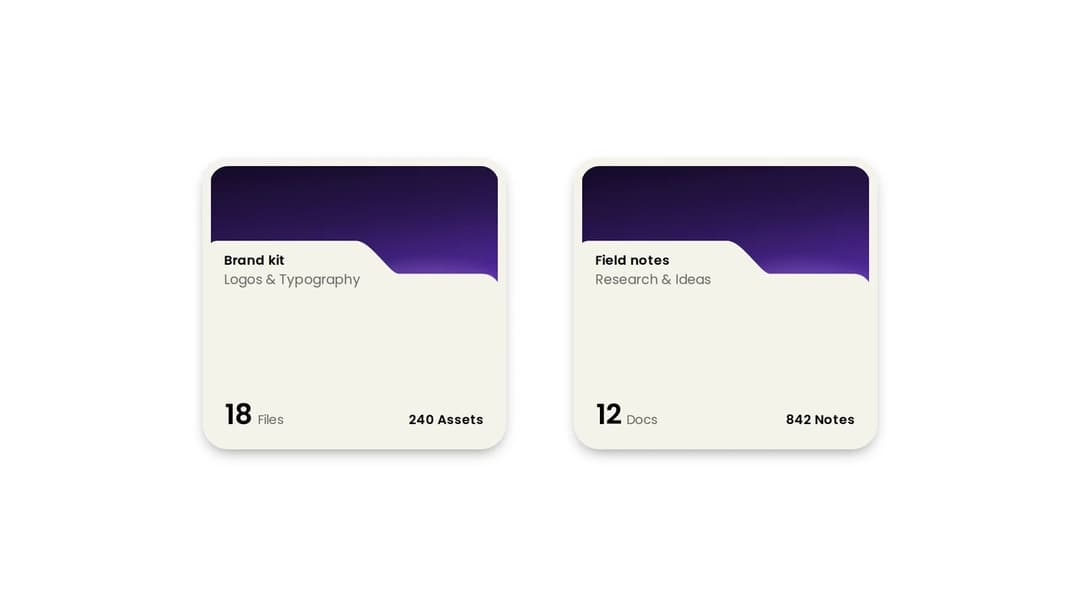
A folder tile with stacked file previews and a count. The silhouette is one path, so the notch and radii stay true at any size instead of drifting the way a rectangle-plus-tab does. Part of Documents & Signing: layro.vercel.app
Built with React and Tailwind. Copy the prompt and paste it into Claude Code, Cursor or Lovable: your agent adds Folder Card to your project and fits it to your theme.
Code
How Folder Card is used: the demo's code. The component's own source comes with a free account.
Usage.tsx
import { FolderCard } from "@/components/ui/folder-card";

export default function FolderCardDemo() {
  return (
    <div className="flex w-full flex-wrap items-center justify-center gap-8 bg-background p-10">
      {/* No cover image, so the built-in aurora gradient stands in. */}
      <FolderCard
        title="Brand kit"
        subtitle="Logos & Typography"
        count="18"
        countLabel="Files"
        meta="240 Assets"
      />

      {/* Every string is a prop; the colours follow the light / dark theme. */}
      <FolderCard
        title="Field notes"
        subtitle="Research & Ideas"
        count="12"
        countLabel="Docs"
        meta="842 Notes"
      />
    </div>
  );
}
Dependencies
More by Mohamed Uvaish
View all

Signature Pad
420
Share Dialog
308
Kanban Board
249
Notification Panel
102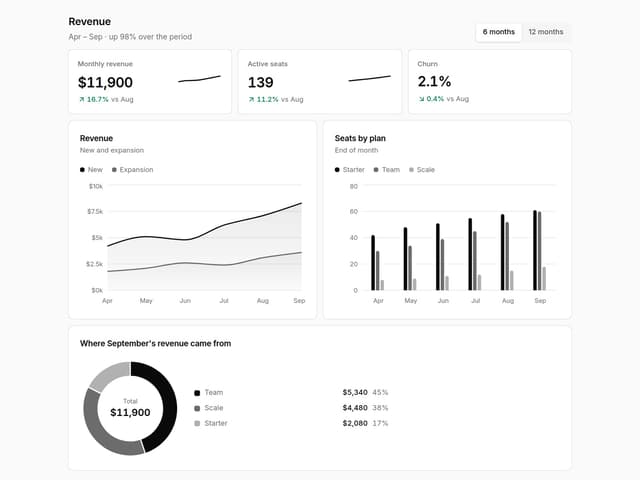
Charts & KPI Cards
86
Rich Text Editor
44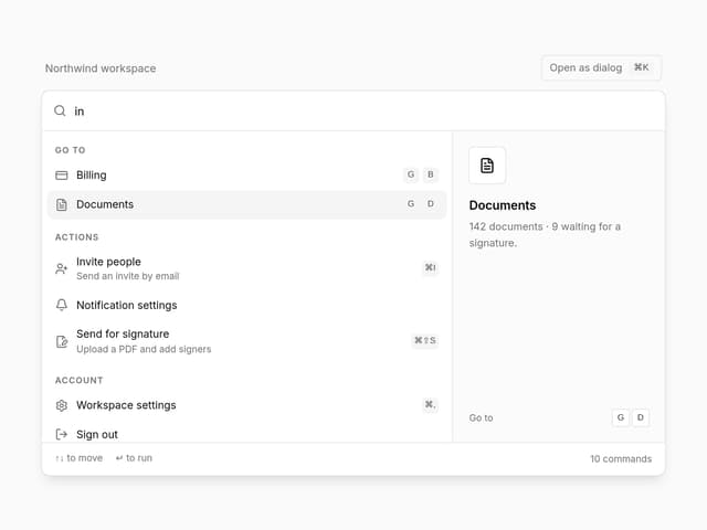
Command Menu
34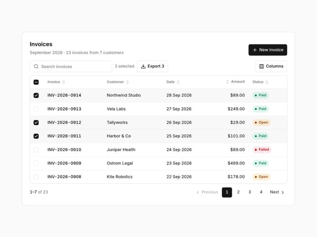
Data Table
32