
About
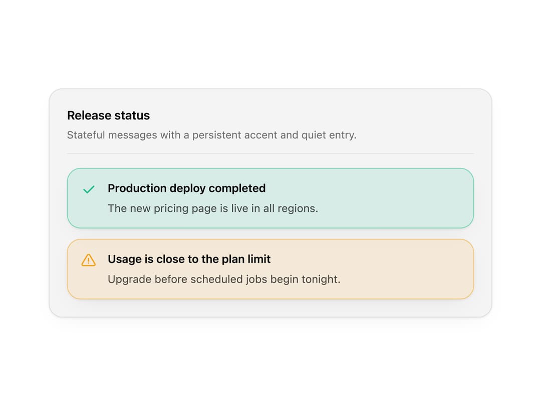
An inline alert and callout for info, success, warning and error messages, with icons, titles, actions and dismiss. Use it for form feedback, system notices and banners.
Built with React and Tailwind. Copy the prompt and paste it into Claude Code, Cursor or Lovable: your agent adds Alert to your project and fits it to your theme.
Code
How Alert is used: the demo's code. The component's own source comes with a free account.
Usage.tsx
"use client";

import * as React from "react";
import { Alert } from "@/components/ui/alert";

import { clsx, type ClassValue } from "clsx";
import { twMerge } from "tailwind-merge";

function cn(...inputs: ClassValue[]) {
  return twMerge(clsx(inputs));
}

const primitivePreviewCardSurfaceFrameClass = cn(
  "relative isolate overflow-hidden rounded-2xl",
  "border",
);

const primitivePreviewCardSurfaceLightClass = cn(
  "border-black/[0.08] bg-[#f4f4f5]",
  "[box-shadow:0_1px_2px_rgba(0,0,0,.06),0_8px_24px_-12px_rgba(0,0,0,.08)]",
);

const primitivePreviewCardSurfaceClass = cn(
  primitivePreviewCardSurfaceFrameClass,
  primitivePreviewCardSurfaceLightClass,
  // Full static `dark:bg-[#0a0a0b]` kept for Tailwind content scan - same as
  // PRIMITIVE_PREVIEW_CANVAS_DARK_BG / PRIMITIVE_PREVIEW_CANVAS_DARK.
  "dark:border-white/[0.06] dark:bg-[#0a0a0b] dark:[box-shadow:0_1px_2px_rgba(0,0,0,.4),0_8px_24px_-12px_rgba(0,0,0,.6)]",
);

const cardSurface = primitivePreviewCardSurfaceClass;

function PreviewPanel({
  title,
  subtitle,
  children,
  className,
}: {
  title: string;
  subtitle?: string;
  children: React.ReactNode;
  className?: string;
}) {
  return (
    <div className={cn(cardSurface, "w-full max-w-lg p-5", className)}>
      <div className="mb-4 border-b border-[var(--border)] pb-3">
        <p className="text-sm font-semibold tracking-[-0.015em] text-[var(--foreground)]">
          {title}
        </p>
        {subtitle ? (
          <p className="mt-1 text-[12px] text-[var(--muted-foreground)]">{subtitle}</p>
        ) : null}
      </div>
      {children}
    </div>
  );
}

export function AlertPreview() {
  return (
    <PreviewPanel title="Release status" subtitle="Stateful messages with a persistent accent and quiet entry.">
      <div className="space-y-3">
        <Alert
          variant="success"
          title="Production deploy completed"
          description="The new pricing page is live in all regions."
        />
        <Alert
          variant="warning"
          title="Usage is close to the plan limit"
          description="Upgrade before scheduled jobs begin tonight."
        />
      </div>
    </PreviewPanel>
  );
}

export default function Demo() {
  return <AlertPreview />;
}
Dependencies
More by Wensity Labs
View all

Sidebar
235
Calendar
173
Button
76
Color Picker
64
Image Comparison Slider
55
AI Prompt Input
50
Text Morphing
37
Navigation Menu
36