
About
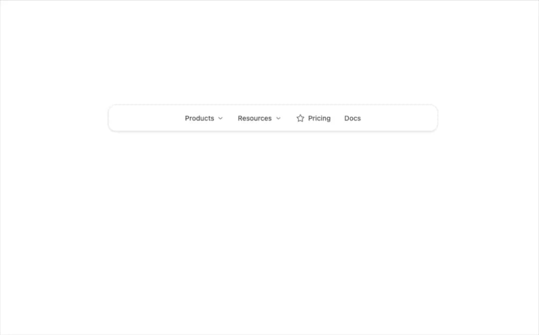
A header navigation menu with animated dropdown panels, mega menus and nested links, fully keyboard accessible. Use it for marketing sites and SaaS navbars.
Built with React and Tailwind. Copy the prompt and paste it into Claude Code, Cursor or Lovable: your agent adds Navigation Menu to your project and fits it to your theme.
Code
How Navigation Menu is used: the demo's code. The component's own source comes with a free account.
Usage.tsx
"use client";

import * as React from "react";
import { IconBolt, IconBook, IconChartBar, IconCloud, IconCode, IconMessage, IconShield, IconStar } from "@tabler/icons-react";
import { NavigationMenu, NavigationMenuList, NavigationMenuItem, NavigationMenuTrigger, NavigationMenuContent, NavigationMenuLink, NavigationMenuIcon } from "@/components/ui/navigation-menu";

import { clsx, type ClassValue } from "clsx";
import { twMerge } from "tailwind-merge";

function cn(...inputs: ClassValue[]) {
  return twMerge(clsx(inputs));
}

/* ─── Shared surface for preview panels ─────────────────────── */

function Panel({ children }: { children: React.ReactNode }) {
  return (
    <div className="flex min-h-[440px] w-full items-start justify-center px-6 pt-12">
      <div className="flex w-full max-w-2xl items-center justify-center rounded-2xl border border-[var(--border)] bg-[var(--card)] px-4 py-2 shadow-sm">
        {children}
      </div>
    </div>
  );
}

/* ─── Link tile used inside content panels ──────────────────── */

function LinkTile({
  icon,
  label,
  description,
  href = "#",
}: {
  icon?: React.ReactNode;
  label: string;
  description?: string;
  href?: string;
}) {
  return (
    <a
      href={href}
      className={cn(
        "group/nav-link flex items-start gap-3 rounded-lg px-3 py-2.5 outline-none transition-colors duration-100",
        "hover:bg-[color-mix(in_srgb,var(--foreground)_5%,var(--background))]",
        "focus-visible:ring-2 focus-visible:ring-[color-mix(in_srgb,var(--foreground)_15%,transparent)]",
      )}
    >
      {icon && (
        <span className="mt-0.5 flex size-8 shrink-0 items-center justify-center rounded-lg bg-[color-mix(in_srgb,var(--foreground)_5%,var(--background))] text-[var(--muted-foreground)] group-hover/nav-link:text-[var(--foreground)] transition-colors">
          {icon}
        </span>
      )}
      <div className="flex flex-col">
        <span className="text-[14px] font-medium text-[var(--foreground)] leading-snug">
          {label}
        </span>
        {description && (
          <span className="text-[12px] text-[color-mix(in_srgb,var(--foreground)_50%,transparent)] leading-snug mt-0.5">
            {description}
          </span>
        )}
      </div>
    </a>
  );
}

/* ─── Base Preview ──────────────────────────────────────────── */

export function NavigationMenuPreview() {
  return (
    <Panel>
      <NavigationMenu defaultValue="products">
        <NavigationMenuList className="justify-center">
          <NavigationMenuItem value="products">
            <NavigationMenuTrigger>Products</NavigationMenuTrigger>
            <NavigationMenuContent width="w-[28rem]">
              <div className="grid grid-cols-2 gap-1">
                <LinkTile
                  icon={<IconBolt size={18} stroke={1.75} />}
                  label="Platform"
                  description="Core infrastructure"
                />
                <LinkTile
                  icon={<IconCloud size={18} stroke={1.75} />}
                  label="Cloud"
                  description="Managed hosting"
                />
                <LinkTile
                  icon={<IconShield size={18} stroke={1.75} />}
                  label="Security"
                  description="Enterprise-grade"
                />
                <LinkTile
                  icon={<IconChartBar size={18} stroke={1.75} />}
                  label="Analytics"
                  description="Real-time insights"
                />
              </div>
            </NavigationMenuContent>
          </NavigationMenuItem>
          <NavigationMenuItem>
            <NavigationMenuTrigger>Resources</NavigationMenuTrigger>
            <NavigationMenuContent width="w-[20rem]">
              <LinkTile
                icon={<IconBook size={18} stroke={1.75} />}
                label="Documentation"
                description="Guides and API reference"
              />
              <LinkTile
                icon={<IconCode size={18} stroke={1.75} />}
                label="API"
                description="Developer resources"
              />
              <LinkTile
                icon={<IconMessage size={18} stroke={1.75} />}
                label="Community"
                description="Forums and Discord"
              />
            </NavigationMenuContent>
          </NavigationMenuItem>
          <NavigationMenuItem>
            <NavigationMenuLink href="#">
              <NavigationMenuIcon>
                <IconStar size={18} stroke={1.75} />
              </NavigationMenuIcon>
              Pricing
            </NavigationMenuLink>
          </NavigationMenuItem>
          <NavigationMenuItem>
            <NavigationMenuLink href="#">Docs</NavigationMenuLink>
          </NavigationMenuItem>
        </NavigationMenuList>
      </NavigationMenu>
    </Panel>
  );
}

/* ─── Mega Menu ─────────────────────────────────────────────── */

/* ─── Icons ─────────────────────────────────────────────────── */

/* ─── Descriptions ──────────────────────────────────────────── */

/* ─── Nested ────────────────────────────────────────────────── */

/* ─── Compact ───────────────────────────────────────────────── */

export default function Demo() {
  return <NavigationMenuPreview />;
}
Dependencies
More by Wensity Labs
View all

Sidebar
225
Calendar
167
Button
72
Color Picker
61
Image Comparison Slider
54
AI Prompt Input
47
Text Morphing
35
Text Blur Reveal
34
More in Navigation
View all

Tabs
52
Navbar with Theme Toggle
40

Breadcrumb
12
Nav List Card
30
Pagination Ant
3

Pagination
85
Pagination
9

Animated Tabs
40


