
About
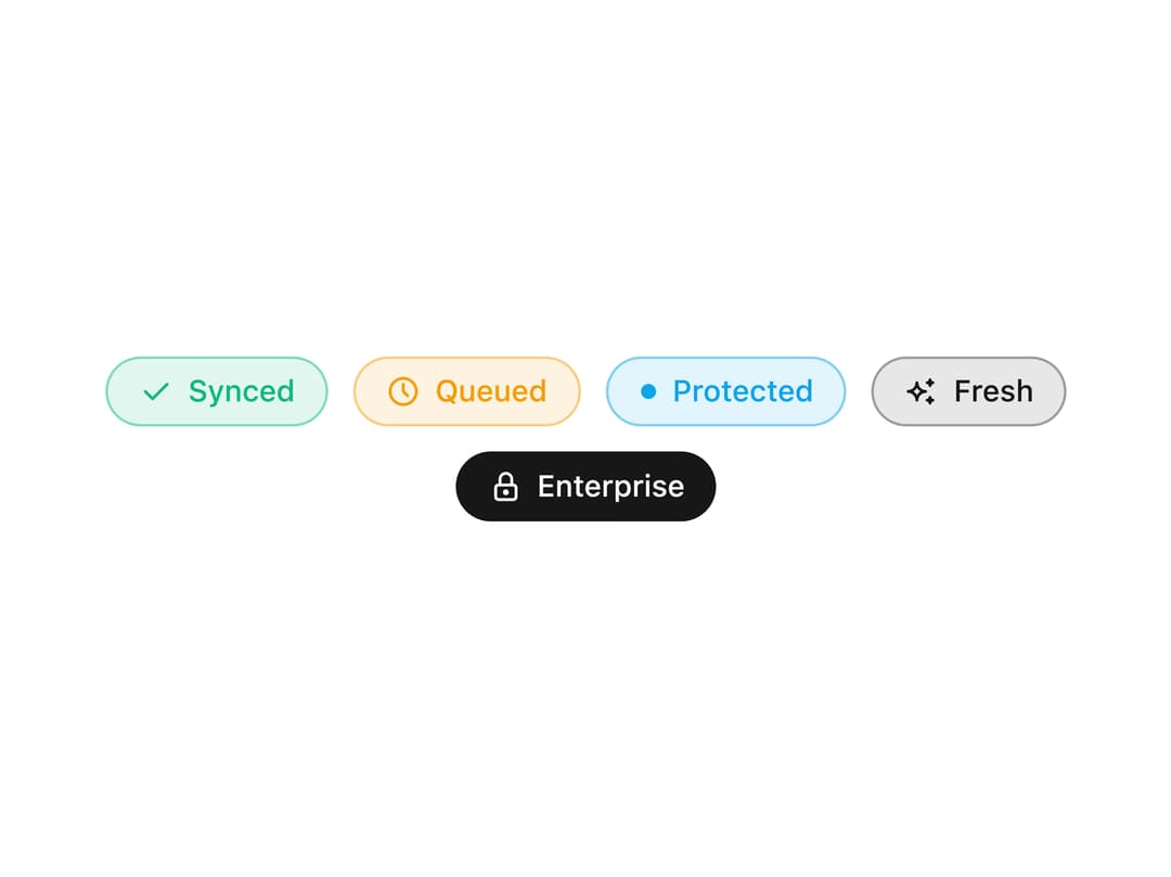
A compact badge for status labels, counts and removable filter chips, with color variants, dot indicators and icons. Use it in tables, cards and nav items.
Built with React and Tailwind. Copy the prompt and paste it into Claude Code, Cursor or Lovable: your agent adds Badge to your project and fits it to your theme.
Code
How Badge is used: the demo's code. The component's own source comes with a free account.
Usage.tsx
"use client";

import * as React from "react";
import { IconCheck, IconClock, IconLock, IconSparkles } from "@tabler/icons-react";
import { Badge } from "@/components/ui/badge";

export function BadgePreview() {
  return (
    <div className="flex max-w-md flex-wrap items-center justify-center gap-2.5 px-4">
      <Badge variant="success" leftIcon={<IconCheck />} interactive>
        Synced
      </Badge>
      <Badge variant="warning" leftIcon={<IconClock />} interactive>
        Queued
      </Badge>
      <Badge variant="info" dot>
        Protected
      </Badge>
      <Badge variant="brand" leftIcon={<IconSparkles />} interactive>
        Fresh
      </Badge>
      <Badge variant="carbon" leftIcon={<IconLock />} interactive>
        Enterprise
      </Badge>
    </div>
  );
}

export default function Demo() {
  return <BadgePreview />;
}
Dependencies
More by Wensity Labs
View all

Sidebar
235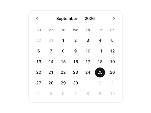
Calendar
173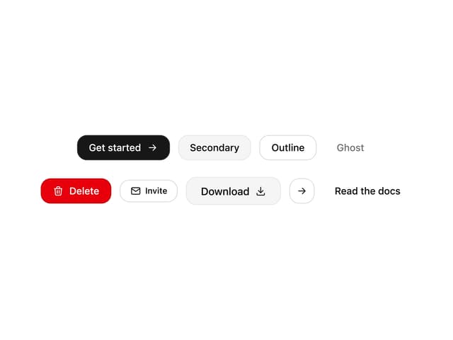
Button
76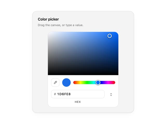
Color Picker
64
Image Comparison Slider
55
AI Prompt Input
50
Text Morphing
37
Navigation Menu
36