
About
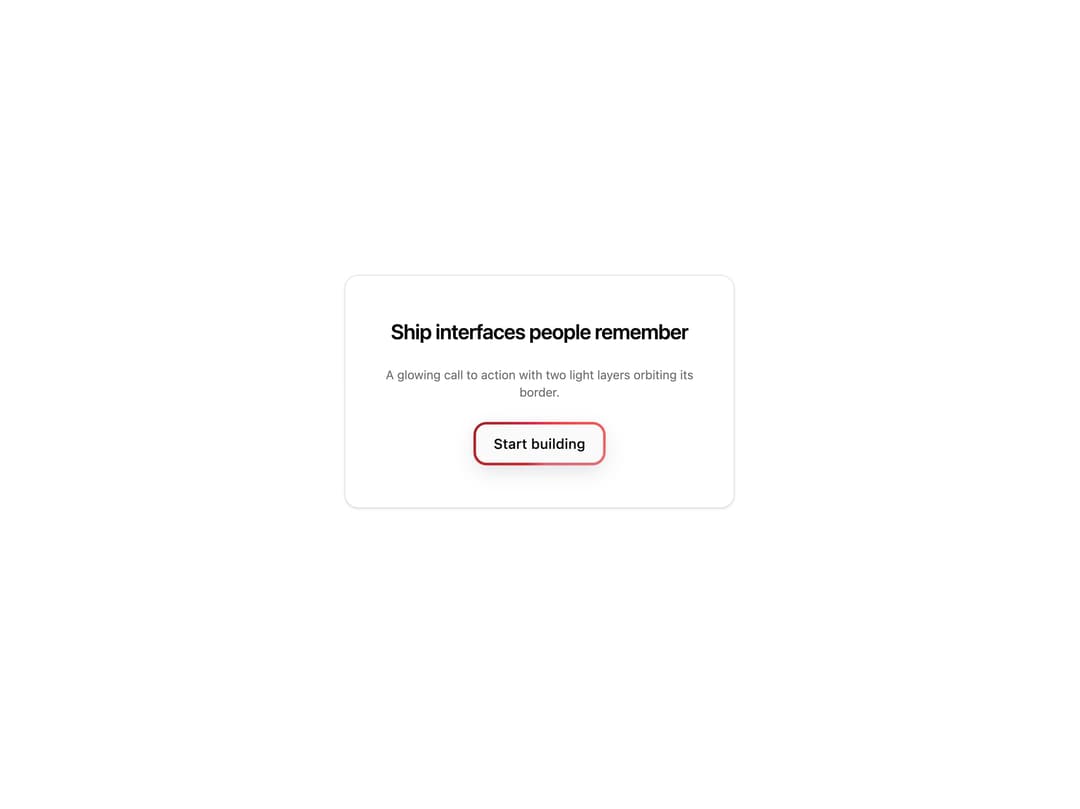
A glowing CTA button with two animated light layers orbiting its border. Works on buttons and links, perfect for hero calls to action, pricing CTAs and signup buttons.
Built with React and Tailwind. Copy the prompt and paste it into Claude Code, Cursor or Lovable: your agent adds Cool Button to your project and fits it to your theme.
Code
How Cool Button is used: the demo's code. The component's own source comes with a free account.
Usage.tsx
"use client";

import { CoolButton } from "@/components/ui/cool-button";

const settings = {
  label: "Start building",
  headline: "Ship interfaces people remember",
};

export default function Demo(props: Partial<typeof settings>) {
  const s = { ...settings, ...props };

  return (
    <div className="flex min-h-[360px] w-full items-center justify-center px-6 py-12">
      <div className="flex w-full max-w-md flex-col items-center gap-6 rounded-2xl border border-[var(--border)] bg-[var(--card)] px-8 py-12 text-center shadow-sm">
        <h2 className="text-2xl font-semibold tracking-tight text-[var(--foreground)]">
          {s.headline}
        </h2>
        <p className="text-sm text-[var(--muted-foreground)]">
          A glowing call to action with two light layers orbiting its border.
        </p>
        <CoolButton as="button">{s.label}</CoolButton>
      </div>
    </div>
  );
}
Dependencies
More by Wensity Labs
View all

Sidebar
229
Calendar
171
Button
76
Color Picker
62
Image Comparison Slider
55
AI Prompt Input
50
Navigation Menu
36
Text Morphing
35
More in Buttons
View all

Button
14
Button
34
Texture Button
92
Button Save
46

Button
64

Button Group
3

Button


Notification Button
103

