
About
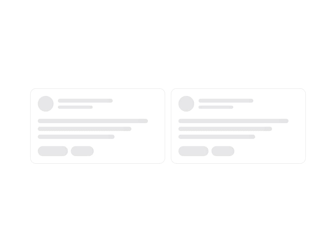
A loading wrapper that runs one angled shimmer sweep across everything inside it instead of a separate shimmer per row. Wrap any card, list or table skeleton for a smooth, layout safe loading state.
Built with React and Tailwind. Copy the prompt and paste it into Claude Code, Cursor or Lovable: your agent adds Shimmering Skeleton Wrapper to your project and fits it to your theme.
Code
How Shimmering Skeleton Wrapper is used: the demo's code. The component's own source comes with a free account.
Usage.tsx
"use client";

import { ShimmeringSkeletonWrapper, SkeletonBox, SkeletonLine, SkeletonCircle } from "@/components/ui/shimmering-skeleton-wrapper";
/* ───────────────────────── Shimmering Skeleton Wrapper ───────────────── */

function SkeletonCardSample() {
  return (
    <div className="rounded-2xl border border-[var(--border)] bg-[color:var(--surface,var(--card))] p-5">
      <div className="flex items-center gap-3">
        <SkeletonCircle size={44} />
        <div className="flex-1 space-y-2">
          <SkeletonLine width="55%" height={11} />
          <SkeletonLine width="35%" height={9} />
        </div>
      </div>
      <div className="mt-5 space-y-2.5">
        <SkeletonLine width="92%" />
        <SkeletonLine width="78%" />
        <SkeletonLine width="64%" />
      </div>
      <div className="mt-5 flex items-center gap-2">
        <SkeletonBox width={84} height={28} radius={9999} />
        <SkeletonBox width={64} height={28} radius={9999} />
      </div>
    </div>
  );
}

export function ShimmeringSkeletonWrapperPreview() {
  return (
    <div className="grid w-full place-items-center px-6 py-10">
      <ShimmeringSkeletonWrapper className="w-full max-w-3xl" rounded="rounded-3xl">
        <div className="grid grid-cols-1 gap-4 sm:grid-cols-2">
          <SkeletonCardSample />
          <SkeletonCardSample />
        </div>
      </ShimmeringSkeletonWrapper>
    </div>
  );
}

export default function Demo() {
  return <ShimmeringSkeletonWrapperPreview />;
}
Dependencies
More by Wensity Labs
View all

Sidebar
235
Calendar
173
Button
76
Color Picker
64
Image Comparison Slider
55
AI Prompt Input
50
Text Morphing
37
Navigation Menu
36