
About
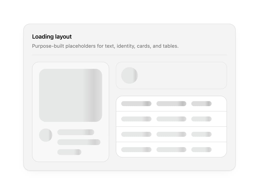
Skeleton loading placeholders for text, avatars, cards and tables, with a subtle shimmer. Compose them to match any layout while content loads.
Built with React and Tailwind. Copy the prompt and paste it into Claude Code, Cursor or Lovable: your agent adds Skeleton to your project and fits it to your theme.
Code
How Skeleton is used: the demo's code. The component's own source comes with a free account.
Usage.tsx
"use client";

import * as React from "react";
import { SkeletonAvatar, SkeletonCard, SkeletonTable, SkeletonText } from "@/components/ui/skeleton";

import { clsx, type ClassValue } from "clsx";
import { twMerge } from "tailwind-merge";

function cn(...inputs: ClassValue[]) {
  return twMerge(clsx(inputs));
}

const primitivePreviewCardSurfaceFrameClass = cn(
  "relative isolate overflow-hidden rounded-2xl",
  "border",
);

const primitivePreviewCardSurfaceLightClass = cn(
  "border-black/[0.08] bg-[#f4f4f5]",
  "[box-shadow:0_1px_2px_rgba(0,0,0,.06),0_8px_24px_-12px_rgba(0,0,0,.08)]",
);

const primitivePreviewCardSurfaceClass = cn(
  primitivePreviewCardSurfaceFrameClass,
  primitivePreviewCardSurfaceLightClass,
  // Full static `dark:bg-[#0a0a0b]` kept for Tailwind content scan - same as
  // PRIMITIVE_PREVIEW_CANVAS_DARK_BG / PRIMITIVE_PREVIEW_CANVAS_DARK.
  "dark:border-white/[0.06] dark:bg-[#0a0a0b] dark:[box-shadow:0_1px_2px_rgba(0,0,0,.4),0_8px_24px_-12px_rgba(0,0,0,.6)]",
);

const cardSurface = primitivePreviewCardSurfaceClass;

function PreviewPanel({
  title,
  subtitle,
  children,
  className,
}: {
  title: string;
  subtitle?: string;
  children: React.ReactNode;
  className?: string;
}) {
  return (
    <div className={cn(cardSurface, "w-full max-w-lg p-5", className)}>
      <div className="mb-4 border-b border-[var(--border)] pb-3">
        <p className="text-sm font-semibold tracking-[-0.015em] text-[var(--foreground)]">
          {title}
        </p>
        {subtitle ? (
          <p className="mt-1 text-[12px] text-[var(--muted-foreground)]">{subtitle}</p>
        ) : null}
      </div>
      {children}
    </div>
  );
}

export function SkeletonPreview() {
  return (
    <PreviewPanel title="Loading layout" subtitle="Purpose-built placeholders for text, identity, cards, and tables.">
      <div className="grid gap-4 sm:grid-cols-[0.82fr_1.18fr]">
        <SkeletonCard />
        <div className="space-y-4">
          <div className="flex items-center gap-3 rounded-xl border border-[var(--border)] p-3">
            <SkeletonAvatar />
            <SkeletonText rows={2} widths={["64%", "42%"]} />
          </div>
          <SkeletonTable rows={3} columns={3} />
        </div>
      </div>
    </PreviewPanel>
  );
}

export default function Demo() {
  return <SkeletonPreview />;
}
Dependencies
More by Wensity Labs
View all

Sidebar
229
Calendar
171
Button
76
Color Picker
62
Image Comparison Slider
55
AI Prompt Input
50
Navigation Menu
36
Text Morphing
35