
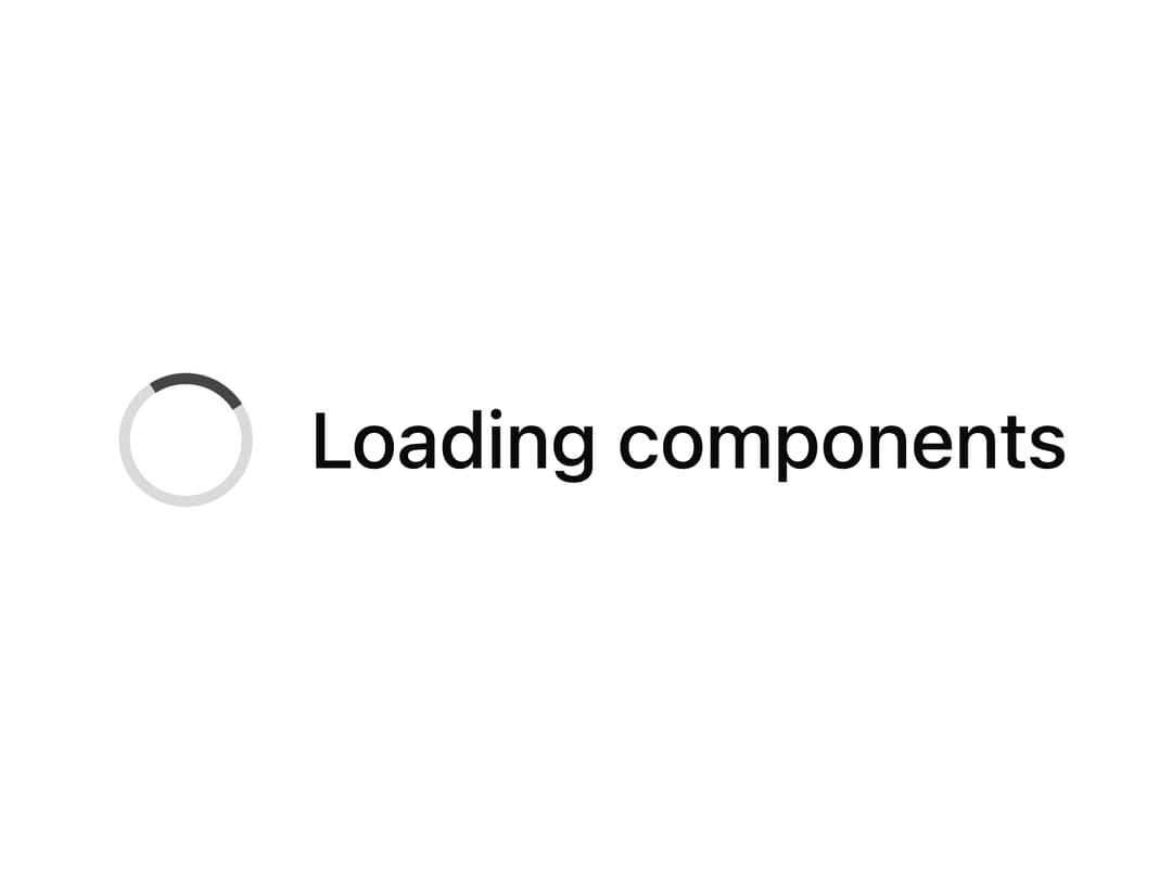
About
A loading spinner primitive with multiple animation styles (spin, ring, dots, pulse), size and color-tone options, plus an overlay variant for blocking a panel while content loads.
Built with React and Tailwind. Copy the prompt and paste it into Claude Code, Cursor or Lovable: your agent adds Spinner to your project and fits it to your theme.
Code
How Spinner is used: the demo's code. The component's own source comes with a free account.
Usage.tsx
import Spinner from "@/components/ui/spinner";

export default function SpinnerDemo() {
  return (
    <div className="flex min-h-[240px] w-full items-center justify-center">
      <Spinner label="Loading components" showLabel />
    </div>
  );
}
More by Wensity Labs
View all

Sidebar
229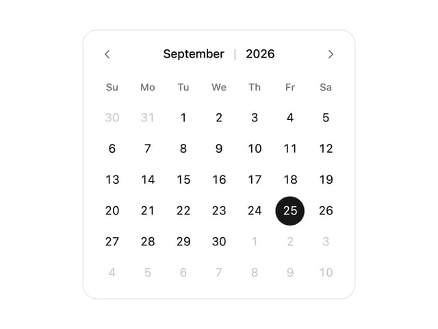
Calendar
171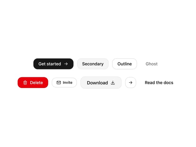
Button
76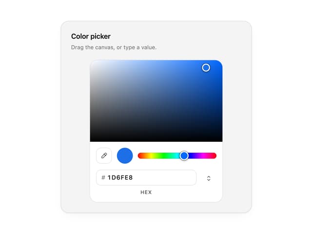
Color Picker
62
Image Comparison Slider
55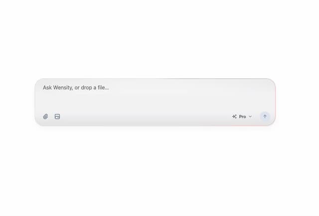
AI Prompt Input
50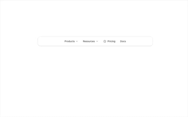
Navigation Menu
36
Text Morphing
35