
About
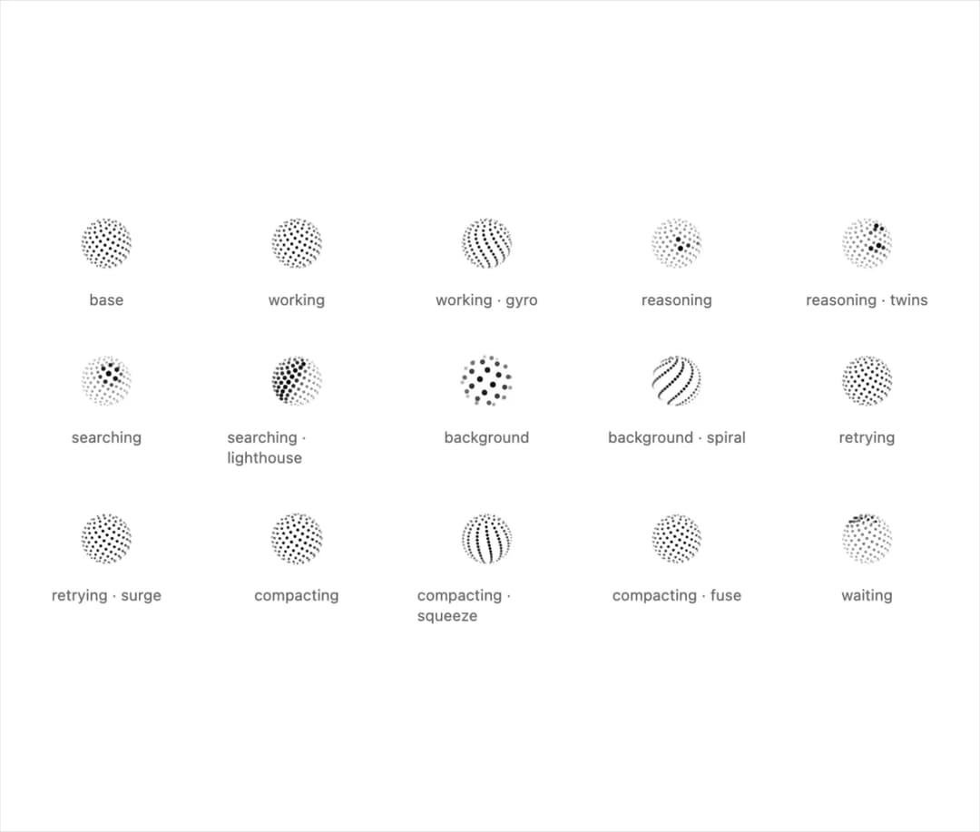
Well-crafted, animated orb status indicators for AI interfaces. For React or plain JS, with no dependencies. More shapes and playground in thinkingorbs.com .
Built with React and Tailwind. Copy the prompt and paste it into Claude Code, Cursor or Lovable: your agent adds Thinking Orbs to your project and fits it to your theme.
Code
How Thinking Orbs is used: the demo's code. The component's own source comes with a free account.
Usage.tsx
import { Orb, VARIANTS, type OrbLook } from "@/components/ui/thinking-orbs";

const looks = Object.entries(VARIANTS).flatMap(([state, variants]) =>
  variants.map((variant) => ({ state, variant }) as OrbLook),
);

export default function Demo() {
  return (
    <div className="grid grid-cols-3 gap-x-10 gap-y-8 p-10 text-foreground sm:grid-cols-5">
      {looks.map((look) => (
        <div key={`${look.state}-${look.variant}`} className="flex flex-col items-center gap-3">
          <Orb {...look} size={48} />
          <span className="text-xs text-muted-foreground">
            {look.state}
            {look.variant !== "default" && ` · ${look.variant}`}
          </span>
        </div>
      ))}
    </div>
  );
}
More in AI chats
View all

AI Actions
319
Agent Chat
17

System Message
53
Message Thread
35
Color Picker
81
Quota Banner
21

AI Task List
159
Code Block
8


