
About
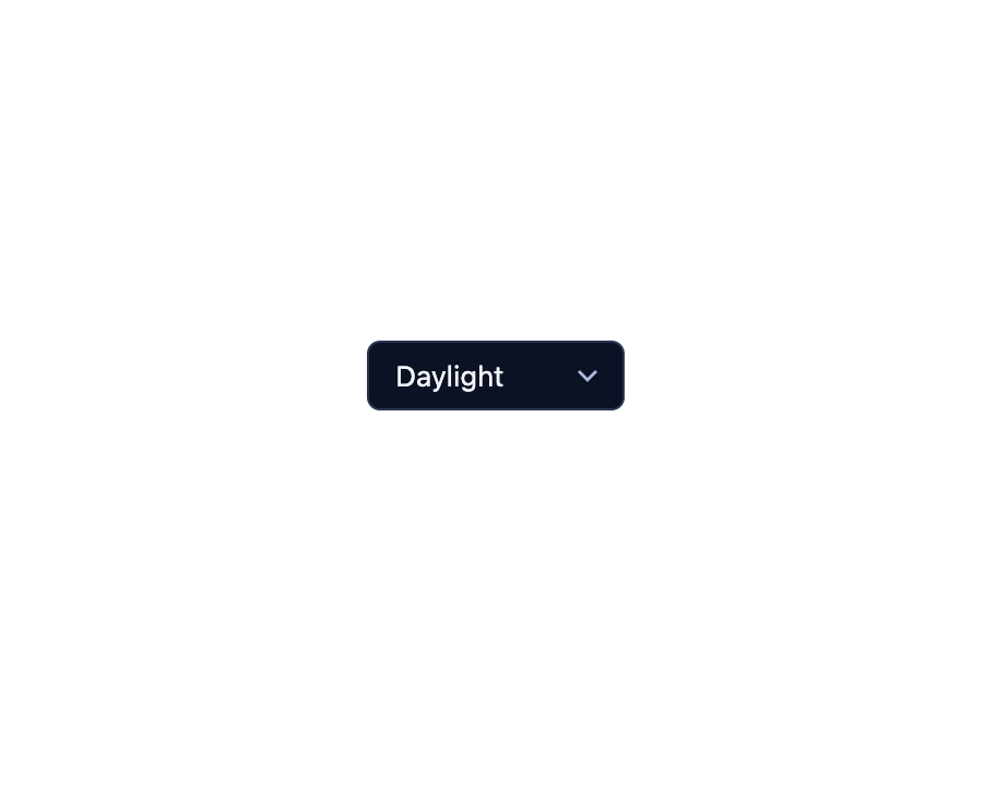
A cookie-backed light/dark/auto theme picker with segmented, select or icon-menu variants, that sets a data attribute on the html element and syncs across every switch on the page.
Built with React and Tailwind. Copy the prompt and paste it into Claude Code, Cursor or Lovable: your agent adds Theme Switch to your project and fits it to your theme.
Code
How Theme Switch is used: the demo's code. The component's own source comes with a free account.
Usage.tsx
import ThemeSwitch from "@/components/ui/theme-switch";

export default function ThemeSwitchSelectDemo() {
  return (
    <div className="flex min-h-[200px] w-full items-center justify-center bg-background p-10">
      <ThemeSwitch
        variant="select"
        cookie="sb-theme-demo2"
        attribute="data-demo-theme"
        themes={["auto", "deep-space", "nebula", "terminal", "daylight"]}
      />
    </div>
  );
}
More by zweiundeins
View all
Busy
7
Odometer
Meter
Radio Group
Gauge
Checkbox Group
QR Code
Alert