
About
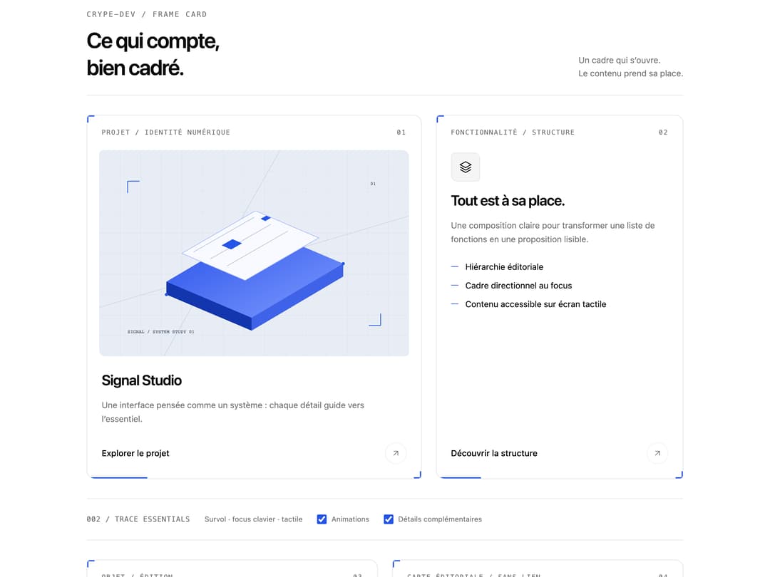
An editorial card with an offset frame, corner markers and scoped GSAP interactions. Includes image, feature and static article layouts, native link semantics, keyboard focus, reduced motion and an image error fallback.
Built with React and Tailwind. Copy the prompt and paste it into Claude Code, Cursor or Lovable: your agent adds Frame Card to your project and fits it to your theme.
Code
How Frame Card is used: the demo's code. The component's own source comes with a free account.
Usage.tsx
'use client'

import { useState } from 'react'
import type { CSSProperties } from 'react'
import FrameCard from '@/components/ui/frame-card'

const settings = {
  title: 'Signal Studio',
  accent: '#2455e6',
  duration: 0.32,
  motion: true,
}

// Embedded vector artwork keeps the demo independent of private assets and image hosts.
const signalImage = `data:image/svg+xml,${encodeURIComponent(`<svg xmlns="http://www.w3.org/2000/svg" width="1200" height="800" viewBox="0 0 1200 800"><defs><pattern id="grid" width="80" height="80" patternUnits="userSpaceOnUse"><path d="M80 0H0V80" fill="none" stroke="#cbd5e1" stroke-width="1"/></pattern><linearGradient id="plane" x1="0" y1="0" x2="1" y2="1"><stop stop-color="#244ee8"/><stop offset="1" stop-color="#7f9bff"/></linearGradient></defs><rect width="1200" height="800" fill="#e8edf5"/><rect width="1200" height="800" fill="url(#grid)"/><path d="M0 610 1200 255M250 800 700 0" stroke="#adb8cc" fill="none"/><path d="m260 560 355-210 330 140-355 210Z" fill="#111b30"/><path d="m260 510 355-210 330 140-355 210Z" fill="url(#plane)"/><path d="m260 510 330 140v50l-330-140Z" fill="#1335ad"/><path d="m590 650 355-210v50L590 700Z" fill="#3e62e8"/><path d="m320 400 285-165 245 105-285 165Z" fill="#f8faff" stroke="#9bb3ff" stroke-width="2"/><path d="m365 395 235-135M430 422 665 287M495 449 730 314" stroke="#aab9d6" stroke-width="2"/><path d="m474 369 42-24 37 16-42 24Z" fill="#2455e6"/><path d="m625 266 22-12 18 8-22 13Z" fill="#2455e6"/><circle cx="260" cy="560" r="6" fill="#2455e6"/><circle cx="945" cy="440" r="6" fill="#2455e6"/><path d="M110 120h46m-46 0v46M1090 680h-46m46 0v-46" stroke="#2455e6" stroke-width="3" fill="none"/><text x="110" y="710" font-family="monospace" font-size="18" fill="#334155">SIGNAL / SYSTEM STUDY 01</text><text x="1050" y="135" font-family="monospace" font-size="18" fill="#334155">01</text></svg>`)}`
const objectImage = `data:image/svg+xml,${encodeURIComponent(`<svg xmlns="http://www.w3.org/2000/svg" width="1200" height="800" viewBox="0 0 1200 800"><defs><pattern id="lines" width="36" height="36" patternUnits="userSpaceOnUse"><path d="M0 36 36 0" stroke="#28334a" stroke-width="1"/></pattern></defs><rect width="1200" height="800" fill="#101828"/><rect width="1200" height="800" fill="url(#lines)"/><ellipse cx="610" cy="650" rx="250" ry="35" fill="#050b18"/><path d="m440 300 170-100 190 110v220L610 640 440 540Z" fill="#243555" stroke="#7286a9" stroke-width="2"/><path d="m440 300 170 100 190-90-190-110Z" fill="#e9eef8"/><path d="m610 400 190-90v220L610 640Z" fill="#2455e6"/><path d="M610 430v160m25-175v158m25-170v153m25-166v150m25-162v147m25-158v144m25-155v140" stroke="#89a5ff" stroke-width="2"/><path d="M150 130h48m-48 0v48M1050 670h-48m48 0v-48" stroke="#89a5ff" fill="none" stroke-width="3"/><text x="150" y="700" font-family="monospace" font-size="18" fill="#c7d2e8">OBJECT / VOLUME STUDY 02</text></svg>`)}`

export default function FrameCardDemo(props: Partial<typeof settings>) {
  const options = { ...settings, ...props }
  const [motion, setMotion] = useState(true)
  const [details, setDetails] = useState(true)
  const [mounted, setMounted] = useState(true)
  const [brokenImage, setBrokenImage] = useState(false)
  const animation = {
    motion: options.motion && motion,
    duration: options.duration,
  }

  return (
    <div
      data-frame-demo
      className="mx-auto w-full max-w-5xl space-y-8 px-2 py-4 sm:px-4"
      style={
        {
          '--primary': options.accent,
          '--primary-foreground': '#ffffff',
        } as CSSProperties
      }
    >
      <header className="flex flex-wrap items-end justify-between gap-5 border-b border-border pb-6">
        <div>
          <p className="mb-3 font-mono text-xs tracking-[0.16em] text-muted-foreground">
            CRYPE-DEV / FRAME CARD
          </p>
          <h2 className="text-3xl leading-tight font-semibold tracking-[-0.045em] sm:text-4xl">
            Ce qui compte,
            <br />
            bien cadré.
          </h2>
        </div>
        <p className="max-w-56 text-sm leading-relaxed text-muted-foreground">
          Un cadre qui s’ouvre.
          <br />
          Le contenu prend sa place.
        </p>
      </header>

      <div className="grid items-stretch gap-6 md:grid-cols-[1.15fr_0.85fr]">
        <FrameCard
          id="frame-project"
          title={options.title}
          eyebrow="Projet / Identité numérique"
          index="01"
          description="Une interface pensée comme un système : chaque détail guide vers l’essentiel."
          image={{
            src: brokenImage ? 'data:image/png;base64,broken' : signalImage,
            alt: 'Étude graphique de plans superposés et d’une grille architecturale',
            loading: 'eager',
          }}
          href="#frame-destination"
          actionLabel="Explorer le projet"
          {...animation}
        />
        <FrameCard
          id="frame-feature"
          title="Tout est à sa place."
          eyebrow="Fonctionnalité / Structure"
          index="02"
          description="Une composition claire pour transformer une liste de fonctions en une proposition lisible."
          icon={
            <svg
              viewBox="0 0 24 24"
              fill="none"
              stroke="currentColor"
              strokeWidth="1.4"
            >
              <path d="m12 3 9 5-9 5-9-5Z" />
              <path d="m3 12 9 5 9-5M3 16l9 5 9-5" />
            </svg>
          }
          details={
            details
              ? [
                  'Hiérarchie éditoriale',
                  'Cadre directionnel au focus',
                  'Contenu accessible sur écran tactile',
                ]
              : undefined
          }
          href="#frame-destination"
          actionLabel="Découvrir la structure"
          {...animation}
        />
      </div>

      <div className="flex flex-wrap items-center gap-x-6 gap-y-2 border-y border-border py-3 text-xs text-muted-foreground">
        <span className="font-mono tracking-wider">002 / TRACE ESSENTIALS</span>
        <span>Survol · focus clavier · tactile</span>
        <label className="flex min-h-11 cursor-pointer items-center gap-2">
          <input
            type="checkbox"
            checked={motion}
            onChange={(event) => setMotion(event.target.checked)}
            className="size-4 accent-primary"
          />
          Animations
        </label>
        <label className="flex min-h-11 cursor-pointer items-center gap-2">
          <input
            id="frame-details"
            type="checkbox"
            checked={details}
            onChange={(event) => setDetails(event.target.checked)}
            className="size-4 accent-primary"
          />
          Détails complémentaires
        </label>
      </div>

      <section aria-label="Autres usages" className="grid gap-6 md:grid-cols-2">
        <FrameCard
          id="frame-product"
          title="Volume 02"
          eyebrow="Objet / Édition"
          index="03"
          description="Un aperçu produit cadré, une silhouette nette et une destination directe."
          image={{
            src: objectImage,
            alt: 'Volume cubique bleu et blanc sur un fond quadrillé sombre',
          }}
          href="#frame-destination"
          actionLabel="Voir l’objet"
          {...animation}
        />
        {mounted && (
          <FrameCard
            id="frame-static"
            title="Le contenu suffit."
            eyebrow="Carte éditoriale / Sans lien"
            index="04"
            description="Une carte peut informer sans déclencher d’action. Sa structure reste lisible, sans faux bouton ni étape cachée."
            details={[
              'Article sémantique, sans arrêt clavier ajouté',
              'Aucun détail réservé au survol',
              'La préférence de mouvement réduit reste prioritaire',
            ]}
            {...animation}
          />
        )}
      </section>

      <section
        id="frame-destination"
        className="scroll-mt-6 space-y-4 rounded-lg border border-border p-5"
      >
        <h3 className="text-sm font-medium">Destination de démonstration</h3>
        <p className="text-sm leading-relaxed text-muted-foreground">
          Les cartes liées ouvrent cette section. Les visuels sont intégrés à la
          démo et ne nécessitent aucun service externe.
        </p>
        <div className="flex flex-wrap gap-x-6 gap-y-2 text-xs">
          <label className="flex min-h-11 cursor-pointer items-center gap-2">
            <input
              id="frame-mount"
              type="checkbox"
              checked={mounted}
              onChange={(event) => setMounted(event.target.checked)}
              className="size-4 accent-primary"
            />
            Afficher la carte éditoriale
          </label>
          <label className="flex min-h-11 cursor-pointer items-center gap-2">
            <input
              id="frame-broken-image"
              type="checkbox"
              checked={brokenImage}
              onChange={(event) => setBrokenImage(event.target.checked)}
              className="size-4 accent-primary"
            />
            Simuler une image indisponible
          </label>
        </div>
      </section>
    </div>
  )
}
Dependencies
More by crype
View all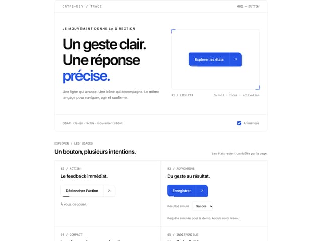

Trace Button
More in Cards
View all
Stats cards with links
33

Course Design Cards
1.1K

Card
70
Statistics Card 2
264
Statistics Card 10
263

Card
17

Card Studio
9
The Item one
3
