About
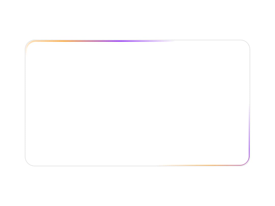
An animated beam of light that travels along the border of a container to highlight cards, buttons, and inputs.
Built with React and Tailwind. Copy the prompt and paste it into Claude Code, Cursor or Lovable: your agent adds Border Beam to your project and fits it to your theme.
Code
How Border Beam is used: the demo's code. The component's own source comes with a free account.
Usage.tsx
import { BorderBeam } from "@/components/ui/border-beam";

const settings = {
  size: 200,
  duration: 12,
  delay: 0,
  colorFrom: "#ffaa40",
  colorTo: "#9c40ff",
  borderWidth: 1.5,
  squircle: false,
};

export default function Demo(props: Partial<typeof settings>) {
  const s = { ...settings, ...props };
  return (
    <div className="flex h-screen w-screen items-center justify-center bg-background">
      <div className="relative h-[180px] w-[320px] overflow-hidden rounded-xl border bg-card">
        <BorderBeam
          size={s.size}
          duration={s.duration}
          delay={s.delay}
          colorFrom={s.colorFrom}
          colorTo={s.colorTo}
          borderWidth={s.borderWidth}
          squircle={s.squircle}
        />
      </div>
    </div>
  );
}
More by gooseui
View all

Features Grid
79
Typography
More in Cards
View all
Stats cards with links
33

Course Design Cards
1.1K

Card
70
Statistics Card 2
264
Statistics Card 10
263

Card
17

Card Studio
9
The Item one
3
