About
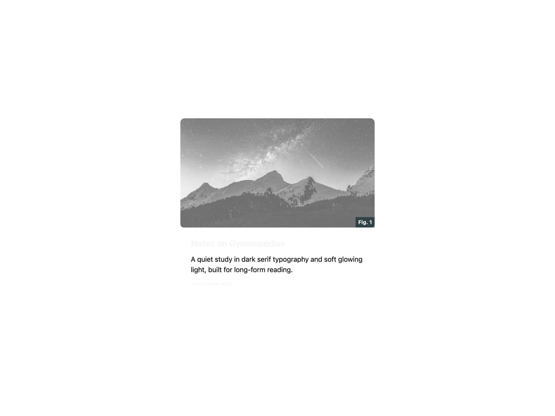
A themed blog article card that shows a hover-reveal cover image, heading, and body copy for reading-focused pages.
Built with React and Tailwind. Copy the prompt and paste it into Claude Code, Cursor or Lovable: your agent adds Article to your project and fits it to your theme.
Code
How Article is used: the demo's code. The component's own source comes with a free account.
Usage.tsx
import { Article } from "@/components/ui/article";

export default function ArticleDemo() {
  return (
    <div className="flex w-full items-center justify-center bg-background p-10">
      <Article
        size="md"
        title="Notes on Gymnopédies"
        description="A quiet study in dark serif typography and soft glowing light, built for long-form reading."
        content="Five minute read"
        image={{
          src: "https://cdn.21st.dev/assets/mirror/dd/ddff508a7ffd97b573b551be00eca437522a941706de53f1e0dff3caf4398c80.jpg",
          alt: "Foggy mountain landscape",
          caption: "Fig. 1",
        }}
      />
    </div>
  );
}
More by shoota
View all

Picture
2
Header Navigation
More in Cards
View all

Statistics Card 2
264

Course Design Cards
1.1K
Card
70
Stats cards with links
39
The Item one
3

Card Studio
7
Statistics Card 7
292

Item
10
