About
A component that dynamically renders a JSX string at runtime, with error boundaries, incomplete-tag auto-closing for streaming output, and injectable custom components like shadcn UI or lucide icons.
Built with React and Tailwind. Copy the prompt and paste it into Claude Code, Cursor or Lovable: your agent adds JSX Renderer to your project and fits it to your theme.
Code
How JSX Renderer is used: the demo's code. The component's own source comes with a free account.
Usage.tsx
"use client";

import { JsxRenderer } from "@/components/ui/jsx-renderer";
import { Calendar, ChefHat, Clock } from "lucide-react";

export default function JsxRendererDisabledDemo() {
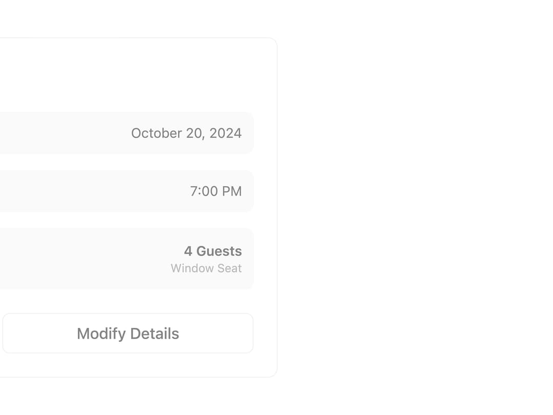
  const jsx = `<div className="max-w-xl rounded-lg border bg-card p-6">
  <div className="flex items-center gap-2 mb-6">
    <ChefHat className="size-5 text-primary" />
    <h2 className="text-xl font-semibold">Restaurant Reservation</h2>
  </div>
  <div className="space-y-4 mb-6">
    <div className="flex items-center justify-between p-3 bg-muted rounded-md">
      <div className="flex items-center gap-2">
        <Calendar className="size-4 text-muted-foreground" />
        <span className="text-sm font-medium">Date</span>
      </div>
      <span className="text-sm">October 20, 2024</span>
    </div>
    <div className="flex items-center justify-between p-3 bg-muted rounded-md">
      <div className="flex items-center gap-2">
        <Clock className="size-4 text-muted-foreground" />
        <span className="text-sm font-medium">Time</span>
      </div>
      <span className="text-sm">7:00 PM</span>
    </div>
    <div className="flex items-center justify-between p-3 bg-muted rounded-md">
      <div>
        <div className="text-sm font-medium mb-1">The Golden Spoon</div>
        <div className="text-xs text-muted-foreground">Italian Cuisine • Downtown</div>
      </div>
      <div className="text-right">
        <div className="text-sm font-semibold">4 Guests</div>
        <div className="text-xs text-muted-foreground">Window Seat</div>
      </div>
    </div>
  </div>
  <div className="flex gap-2">
    <button className="flex-1 bg-primary text-primary-foreground hover:bg-primary/90 px-4 py-2 rounded-md font-medium">
      Confirm Reservation
    </button>
    <button className="flex-1 border border-input bg-background hover:bg-accent hover:text-accent-foreground px-4 py-2 rounded-md font-medium">
      Modify Details
    </button>
  </div>
</div>`;

  return (
    <div className="w-full">
      <JsxRenderer
        jsx={jsx}
        components={{ Calendar, Clock, ChefHat }}
        state="disabled"
        className="w-full"
      />
    </div>
  );
}
Dependencies
More by Alwurts
View all
Chat Input
303
Tool Invocation
46
Model Selector
41
Chat Suggestions
13
Status Edge
7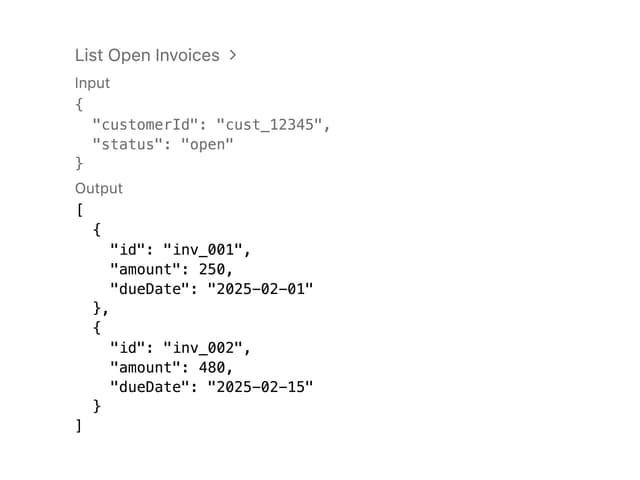
Tool Call
4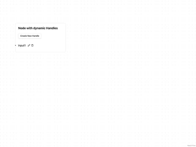
Editable Handle
1