
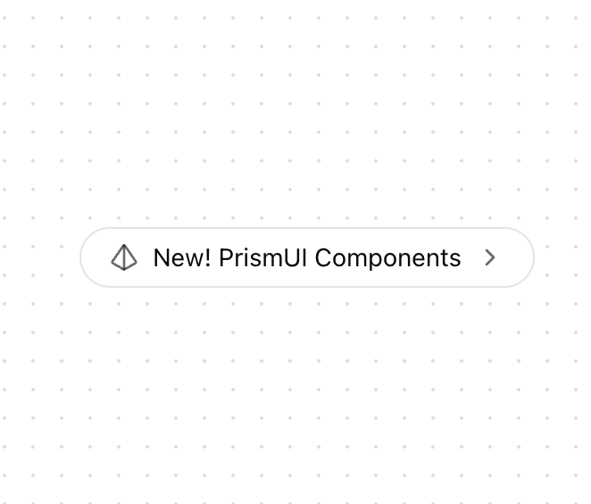
A versatile, animated badge component for highlighting new features, announcements, or important links. Features: • Smooth entrance animations • Icon rotation on hover • Multiple size variants • Multiple style variants • Link and button functionality • Customizable icons • Responsive design • Accessibility features Notes: • Built with Framer Motion for smooth animations • Uses React Server Components (RSC) with the "use client" directive • Employs a responsive design with a mobile-first approach • Includes interactive hover animations • Supports TypeScript with proper types • Allows for custom styling and theming • Optimized performance through proper usage of hooks
Built with React and Tailwind. Copy the prompt and paste it into Claude Code, Cursor or Lovable: your agent adds Hero Badge to your project and fits it to your theme.
Code
How Hero Badge is used: the demo's code. The component's own source comes with a free account.
Usage.tsx
import HeroBadge from "@/components/ui/hero-badge"
import { Icons } from "@/components/ui/icons"

function HeroBadgeBasic() {
  return (
    <div className="flex min-h-[350px] w-full items-center justify-center">
      <HeroBadge
        href="/docs"
        text="New! PrismUI Components"
        icon={<Icons.logo className="h-4 w-4" />}
        endIcon={<Icons.chevronRight className="h-4 w-4" />}
      />
    </div>
  )
}

export { HeroBadgeBasic };
Dependencies
More by Prism UI
View all
Display Cards
5.4K
Pricing
3.8K
Expandable Card
340
Floating Action Panel
198
useExpandable
135
Logo Carousel
132
Icons
128
Popover
104