
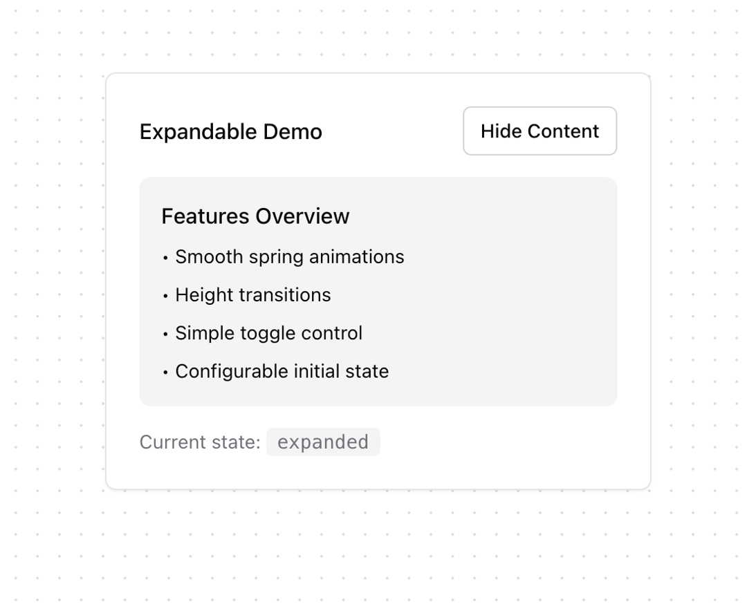
A custom React hook for creating smooth expandable/collapsible elements with spring animations using Framer Motion. Parameters - `initialState` (boolean, optional): Initial expansion state. Defaults to `false`. Returns The hook returns an object with the following properties: - `isExpanded` (boolean): Current expansion state - `toggleExpand` (function): Function to toggle the expansion state - `animatedHeight` (MotionValue): Framer Motion value for animated height Features - Spring-based animations for smooth transitions - Zero-to-auto height animations - Configurable initial state - TypeScript support - Built with Framer Motion for reliable performance
Built with React and Tailwind. Copy the prompt and paste it into Claude Code, Cursor or Lovable: your agent adds useExpandable to your project and fits it to your theme.
Code
How useExpandable is used: the demo's code. The component's own source comes with a free account.
Usage.tsx
'use client'

import { useExpandable } from "@/components/hooks/use-expandable"
import { Button } from "@/components/ui/button"
import { Card } from "@/components/ui/card"
import { motion, AnimatePresence } from "framer-motion"
import { useRef, useEffect } from "react"

export function UseExpandableDemo() {
  const contentRef = useRef<HTMLDivElement>(null)
  const { isExpanded, toggleExpand, animatedHeight } = useExpandable(false)

  useEffect(() => {
    if (contentRef.current) {
      animatedHeight.set(isExpanded ? contentRef.current.offsetHeight : 0)
    }
  }, [isExpanded, animatedHeight])

  return (
    <Card className="p-6 max-w-md mx-auto w-[400px]">
      <div className="space-y-4">
        <div className="flex justify-between items-center gap-2">
          <h3 className="font-medium">Expandable Demo</h3>
          <Button
            variant="outline"
            size="sm"
            onClick={toggleExpand}
          >
            {isExpanded ? 'Hide' : 'Show'} Content
          </Button>
        </div>

        <motion.div
          style={{ height: animatedHeight }}
          className="overflow-hidden bg-muted rounded-lg"
        >
          <div ref={contentRef} className="p-4">
            <h4 className="font-medium mb-2">Features Overview</h4>
            <ul className="space-y-2 text-sm">
              <li>• Smooth spring animations</li>
              <li>• Height transitions</li>
              <li>• Simple toggle control</li>
              <li>• Configurable initial state</li>
            </ul>
          </div>
        </motion.div>

        <div className="text-sm text-muted-foreground">
          Current state: <code className="px-2 py-0.5 bg-muted rounded">{isExpanded ? 'expanded' : 'collapsed'}</code>
        </div>
      </div>
    </Card>
  )
}
Dependencies
More by Prism UI
View all
Display Cards
5.4K
Pricing
3.8K
Expandable Card
340
Floating Action Panel
198
Hero Badge
158
Logo Carousel
132
Icons
128
Popover
104
More in Cards
View all
Stats cards with links
33

Course Design Cards
1.1K

Card
70
Statistics Card 2
264
Statistics Card 10
263

Card
17

Card Studio
9
The Item one
3
