
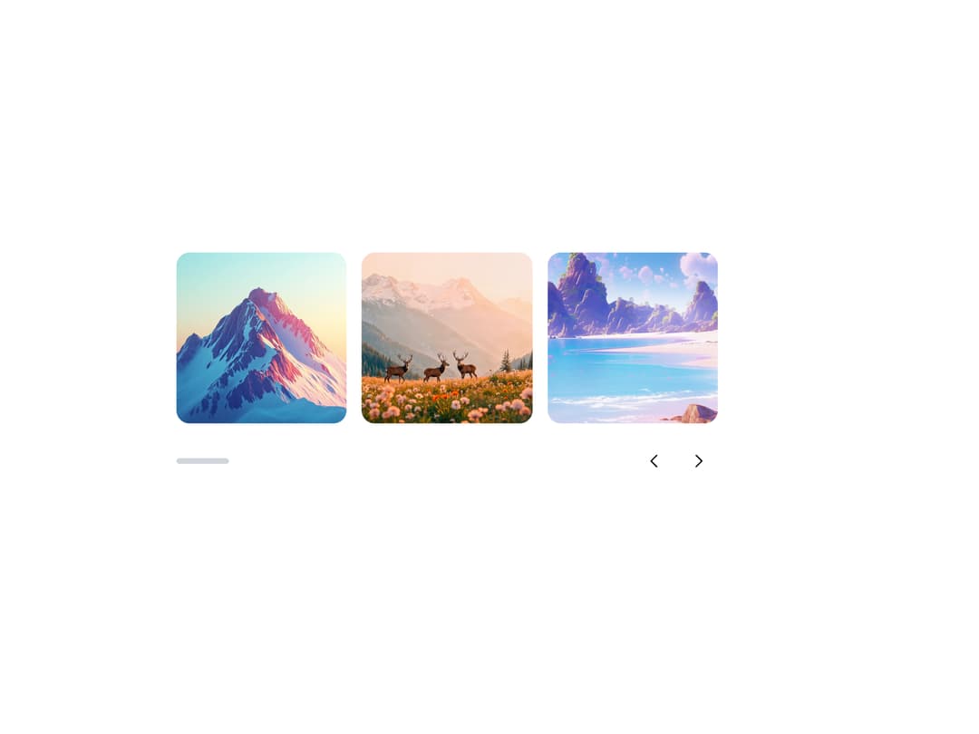
About
A draggable, swipeable image/content slider with arrows, dot pagination, thumbnails, autoplay, fade, and auto-height, for showcasing photo galleries or product shots one slide at a time.
Built with React and Tailwind. Copy the prompt and paste it into Claude Code, Cursor or Lovable: your agent adds Carousel to your project and fits it to your theme.
Code
How Carousel is used: the demo's code. The component's own source comes with a free account.
Usage.tsx
import {
  Carousel,
  CarouselContent,
  CarouselSlide,
  CarouselPrev,
  CarouselNext,
  CarouselProgress,
} from "@/components/ui/carousel";
import { Button } from "@appica/ui-react/button";
import { ChevronLeft, ChevronRight } from "@appica/icons-react";

const SLIDES = [1, 2, 3, 4, 5, 6];

export default function CarouselProgressExample() {
  return (
    <div className="w-full max-w-xl">
      <Carousel align="start">
        <CarouselContent>
          {SLIDES.map((n) => (
            <CarouselSlide key={n} className="basis-1/2 sm:basis-1/3">
              <img
                src={`https://appica.dev/carousel/slide-${n}.jpg`}
                alt={`Slide ${n}`}
                className="aspect-square w-full rounded-xl object-cover"
              />
            </CarouselSlide>
          ))}
        </CarouselContent>
        <div className="mt-5 flex items-center justify-between">
          <CarouselProgress className="w-14" />
          <div className="flex gap-2">
            <CarouselPrev
              position="none"
              render={
                <Button variant="outline" size="icon-md">
                  <ChevronLeft />
                </Button>
              }
            />
            <CarouselNext
              position="none"
              render={
                <Button variant="outline" size="icon-md">
                  <ChevronRight />
                </Button>
              }
            />
          </div>
        </div>
      </Carousel>
    </div>
  );
}
Dependencies
More by appica-dev
View all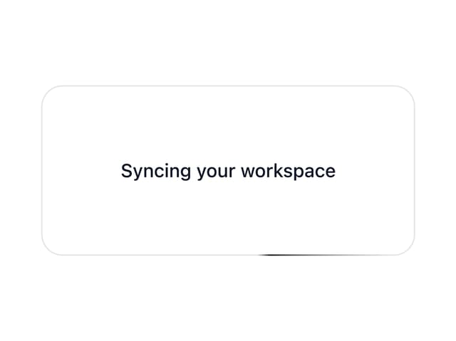
Border Beam
43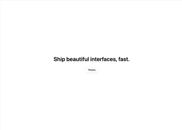
Text Animate
19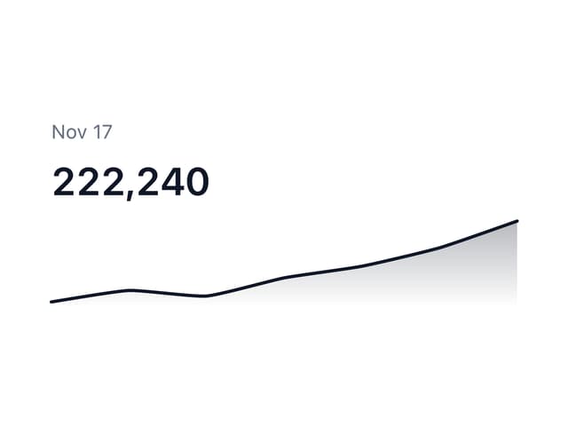
Sparkline
7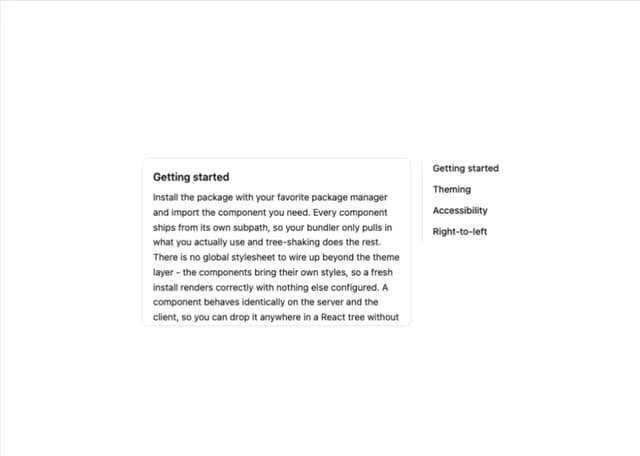
Table of Contents
6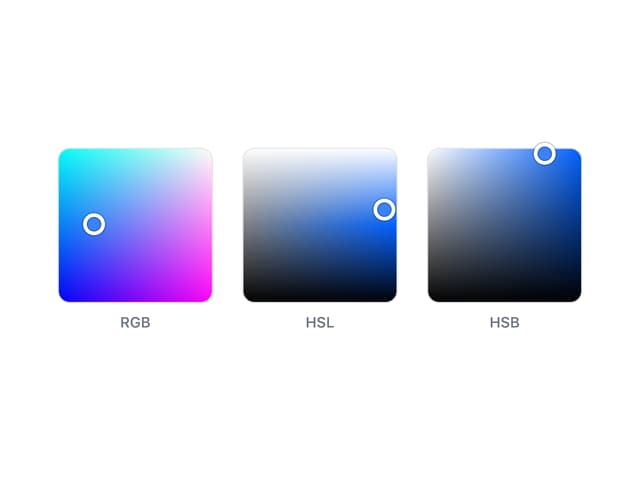
Color Area
6
Avatar
6
Background Pattern
3
Autocomplete
2
More in Galleries
View all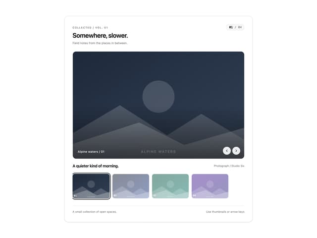
Thumbnail image viewer
43

Animated Gallery
1.4K

Hero Section 6
881
Editorial Collage Hero
430
Layout Grid
826
3D Parallax Unfurling Gallery
981

Image Gallery
90

File Upload
18


