
About
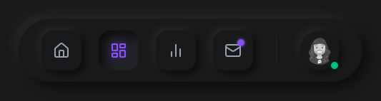
relaxing navbar with light and dark mode
Built with React and Tailwind. Copy the prompt and paste it into Claude Code, Cursor or Lovable: your agent adds Relaxing Navbar to your project and fits it to your theme.
Code
How Relaxing Navbar is used: the demo's code. The component's own source comes with a free account.
Usage.tsx
import React, { useState, useEffect } from 'react';
import { Home, LayoutDashboard, BarChart2, Mail, User } from 'lucide-react';
import { motion, AnimatePresence } from 'framer-motion';

/**
 * PRODUCTION NEUMORPHIC NAVBAR
 *
 * Features:
 * - Real-time light/dark mode support
 * - Tactile convex/concave state transitions
 * - Dynamic sliding highlight
 * - Pulsing "fiber-optic" notification badge
 * - Profile medallion with machined bezel
 */

type NavItem = {
  id: string;
  icon: React.ElementType;
  label: string;
  hasNotification?: boolean;
};

const NAV_ITEMS: NavItem[] = [
  { id: 'home', icon: Home, label: 'Home' },
  { id: 'dashboard', icon: LayoutDashboard, label: 'Dashboard' },
  { id: 'analytics', icon: BarChart2, label: 'Analytics' },
  { id: 'messages', icon: Mail, label: 'Messages', hasNotification: true },
];

const NeumorphicNavbar: React.FC = () => {
  const [activeTab, setActiveTab] = useState('home');
  const [isDarkMode, setIsDarkMode] = useState(false);

  // Sync with system or parent dark mode class
  useEffect(() => {
    const isDark = document.documentElement.classList.contains('dark');
    setIsDarkMode(isDark);

    const observer = new MutationObserver(() => {
      setIsDarkMode(document.documentElement.classList.contains('dark'));
    });

    observer.observe(document.documentElement, { attributes: true, attributeFilter: ['class'] });
    return () => observer.disconnect();
  }, []);

  const getShadows = (state: 'convex' | 'concave' | 'container') => {
    if (isDarkMode) {
      switch (state) {
        case 'container': return 'shadow-[8px_8px_16px_#0c0d0d,-8px_-8px_16px_#242527]';
        case 'convex': return 'shadow-[5px_5px_10px_#0c0d0d,-5px_-5px_10px_#242527]';
        case 'concave': return 'shadow-[inset_6px_6px_12px_#0c0d0d,inset_-6px_-6px_12px_#242527]';
      }
    } else {
      switch (state) {
        case 'container': return 'shadow-[9px_9px_16px_rgb(163,177,198,0.6),-9px_-9px_16px_rgba(255,255,255,0.5)]';
        case 'convex': return 'shadow-[5px_5px_10px_#b8b9be,-5px_-5px_10px_#ffffff]';
        case 'concave': return 'shadow-[inset_6px_6px_10px_#b8b9be,inset_-6px_-6px_10px_#ffffff]';
      }
    }
  };

  return (
    <div className="flex items-center justify-center p-8 bg-[#E0E5EC] dark:bg-[#18191A] transition-colors duration-500">
      <nav
        className={`
          relative flex items-center gap-6 px-8 py-4 rounded-[3rem]
          bg-[#E0E5EC] dark:bg-[#18191A]
          ${getShadows('container')}
          transition-all duration-500
        `}
      >
        {NAV_ITEMS.map((item) => {
          const isActive = activeTab === item.id;
          const Icon = item.icon;

          return (
            <motion.button
              key={item.id}
              onClick={() => setActiveTab(item.id)}
              whileHover={{ scale: 1.02 }}
              whileTap={{ scale: 0.96 }}
              className={`
                relative p-4 rounded-2xl transition-all duration-400 group
                ${isActive ? getShadows('concave') : getShadows('convex')}
                ${isActive ? 'text-cyan-500 dark:text-violet-500' : 'text-gray-500 dark:text-gray-400'}
              `}
            >
              <div className="relative">
                <Icon
                  size={24}
                  className={`
                    transition-all duration-400
                    ${isActive ? 'drop-shadow-[0_0_8px_rgba(6,182,212,0.6)] dark:drop-shadow-[0_0_8px_rgba(139,92,246,0.8)]' : ''}
                  `}
                />

                {item.hasNotification && (
                  <motion.span
                    animate={{
                      scale: [1, 0.8, 1],
                      opacity: [1, 0.6, 1],
                      boxShadow: isDarkMode
                        ? ['0 0 4px #8b5cf6', '0 0 12px #8b5cf6', '0 0 4px #8b5cf6']
                        : ['0 0 4px #22d3ee', '0 0 12px #22d3ee', '0 0 4px #22d3ee']
                    }}
                    transition={{ repeat: Infinity, duration: 2 }}
                    className="absolute -top-1 -right-1 w-2.5 h-2.5 bg-cyan-400 dark:bg-violet-500 rounded-full"
                  />
                )}
              </div>

              {/* Tooltip Label */}
              <span className="absolute -bottom-12 left-1/2 -translate-x-1/2 opacity-0 group-hover:opacity-100 transition-opacity text-[10px] font-black tracking-[0.2em] uppercase text-gray-400 dark:text-zinc-600 pointer-events-none whitespace-nowrap">
                {item.label}
              </span>
            </motion.button>
          );
        })}

        {/* Divider */}
        <div className="w-px h-10 bg-gray-300 dark:bg-zinc-800 mx-2 shadow-inner" />

        {/* Profile Medallion */}
        <motion.div
          className={`
            relative p-1 rounded-full cursor-pointer group
            bg-[#E0E5EC] dark:bg-[#18191A]
            ${getShadows('convex')}
            hover:shadow-none transition-shadow
          `}
          whileHover={{ y: -2 }}
        >
          <div className="w-12 h-12 rounded-full border-4 border-[#E0E5EC] dark:border-[#18191A] overflow-hidden shadow-inner flex items-center justify-center">
             <img
               src="https://cdn.21st.dev/assets/mirror/50/50a7aeaa774ee90c1c63d66bf1ca11bacd72bcb806a8c611691bc2b080d94f60.svg"
               alt="User"
               className="w-full h-full object-cover grayscale group-hover:grayscale-0 transition-all duration-500"
             />
          </div>
          {/* Status Indicator */}
          <div className="absolute bottom-0 right-0 w-3.5 h-3.5 rounded-full bg-emerald-500 border-2 border-[#E0E5EC] dark:border-[#18191A] shadow-sm" />
        </motion.div>
      </nav>
    </div>
  );
};

export default NeumorphicNavbar;

/**
 * STYLING NOTE:
 * Neumorphic designs work best when the container background perfectly matches
 * the element's base color. Ensure the parent section uses:
 * Light: bg-[#E0E5EC]
 * Dark: bg-[#18191A]
 */

/**
 * ANIMATION PHILOSOPHY:
 * We use Framer Motion for the "inertial dampening" effect.
 * The button scale transitions use a slight bounce (0.175, 0.885...)
 * to mimic physical spring-back of polymer buttons.
*/More by ashish rajwani
View all
ASMR background
685
animated pattern cloud
616
Balloons Pop background
362
realistic fog background
309
3d animated stars background
3
Matrix background
1
tab pages
1
sleek text input
More in Buttons
View all
Button Save
46

Button
20

Eclipse Button
5

Button
6

Button
14

Button Group
37

Button
32
Split Button
32

