
About
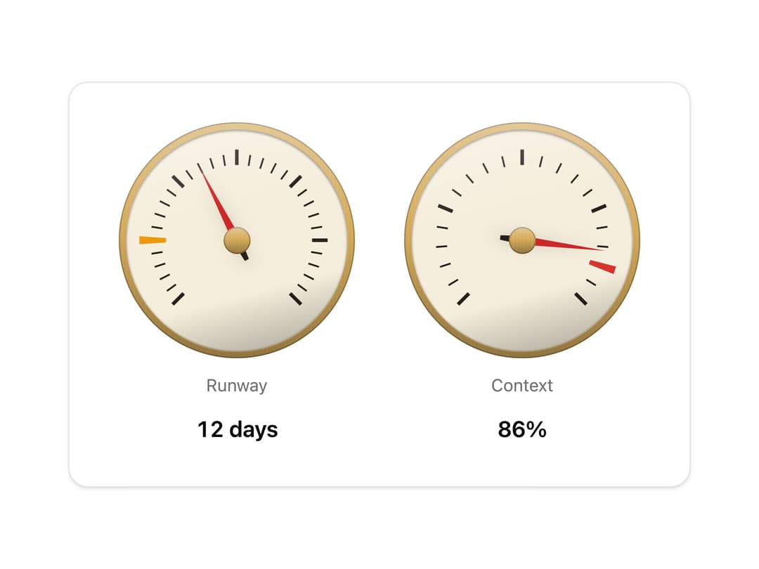
A needle on a brass-bezelled scale. Gauge reads a value; Dial sets one, turned by drag or keyboard. Skeuomorphic, accessible, Base UI. Part of Bevel: bevel-ui.vercel.app
Built with React and Tailwind. Copy the prompt and paste it into Claude Code, Cursor or Lovable: your agent adds Gauge and dial to your project and fits it to your theme.
Code
How Gauge and dial is used: the demo's code. The component's own source comes with a free account.
Usage.tsx
"use client"

import {
  DialMark,
  Gauge,
  GaugeLabel,
  GaugeValue,
} from "@/components/ui/dial"

/** Two readings on a dashboard: days of credit left, and how full the context window is. */
export function DialDashboard() {
  return (
    <div className="flex gap-10 rounded-2xl border bg-card px-10 py-8 shadow-sm">
      <Gauge
        value={12}
        max={30}
        ticks={30}
        getAriaValueText={(_, value) =>
          `${value} days left; auto top-up at 5 days`
        }
        marks={<DialMark value={5} tone="amber" />}
      >
        <GaugeLabel>Runway</GaugeLabel>
        <GaugeValue>{(_, value) => `${value} days`}</GaugeValue>
      </Gauge>
      <Gauge
        value={86}
        max={100}
        ticks={20}
        getAriaValueText={(_, value) => `Context ${value}% full`}
        marks={<DialMark value={90} tone="red" />}
      >
        <GaugeLabel>Context</GaugeLabel>
        <GaugeValue>{(_, value) => `${value}%`}</GaugeValue>
      </Gauge>
    </div>
  )
}

export default DialDashboard
Dependencies
More by Hitesh
View all
Wallet
8
Kbd
4
Number wheel
4
Badge
2
Icon key
1
Ledger
Preset keys
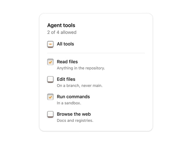
Latch checkbox