

About
A square keycap for a single icon: copy, close, toolbar actions. It must be given an aria-label, and is secondary by default so a row of them stays quiet. Skeuomorphic, accessible, Base UI. Part of Bevel: bevel-ui.vercel.app
Built with React and Tailwind. Copy the prompt and paste it into Claude Code, Cursor or Lovable: your agent adds Icon key to your project and fits it to your theme.
Code
How Icon key is used: the demo's code. The component's own source comes with a free account.
Usage.tsx
"use client"

import * as React from "react"
import { Bold, Check, Copy, Italic, Link, Underline } from "lucide-react"
import { IconKey } from "@/components/ui/icon-key"

const command = "npx shadcn@latest add @bevel/key"

/** Ghost keys in a toolbar, and a copy key that latches while it writes to the clipboard. */
export function IconKeyToolbar() {
  const [marks, setMarks] = React.useState<string[]>(["bold"])
  const [copying, setCopying] = React.useState(false)
  const [copied, setCopied] = React.useState(false)

  const toggle = (mark: string) =>
    setMarks((all) => (all.includes(mark) ? all.filter((m) => m !== mark) : [...all, mark]))

  async function copy() {
    setCopying(true)
    try {
      await navigator.clipboard.writeText(command)
      setCopied(true)
      setTimeout(() => setCopied(false), 1600)
    } catch {
      // Clipboard can be blocked; the command is still on screen to select.
    } finally {
      setCopying(false)
    }
  }

  return (
    <div className="flex w-full max-w-md flex-col gap-4">
      <div role="toolbar" aria-label="Formatting" className="flex gap-1 self-start rounded-lg border bg-card p-1">
        {[
          { mark: "bold", label: "Bold", icon: <Bold /> },
          { mark: "italic", label: "Italic", icon: <Italic /> },
          { mark: "underline", label: "Underline", icon: <Underline /> },
          { mark: "link", label: "Link", icon: <Link /> },
        ].map(({ mark, label, icon }) => (
          <IconKey
            key={mark}
            size="sm"
            variant={marks.includes(mark) ? "secondary" : "ghost"}
            aria-label={label}
            aria-pressed={marks.includes(mark)}
            onClick={() => toggle(mark)}
          >
            {icon}
          </IconKey>
        ))}
      </div>
      <div className="flex items-center gap-2 rounded-lg border bg-card py-1.5 pr-1.5 pl-3">
        <code className="min-w-0 flex-1 truncate text-sm">{command}</code>
        <IconKey size="sm" pending={copying} aria-label={copied ? "Copied" : "Copy command"} onClick={copy}>
          {copied ? <Check /> : <Copy />}
        </IconKey>
      </div>
    </div>
  )
}

export default IconKeyToolbar
Dependencies
More by Hitesh
View all
Number wheel
4
Kbd
3
Wallet
3
Badge
1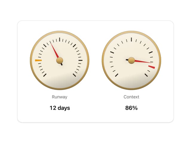
Gauge and dial
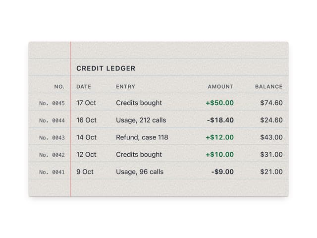
Ledger
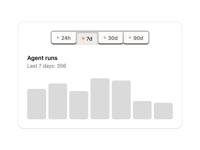
Preset keys
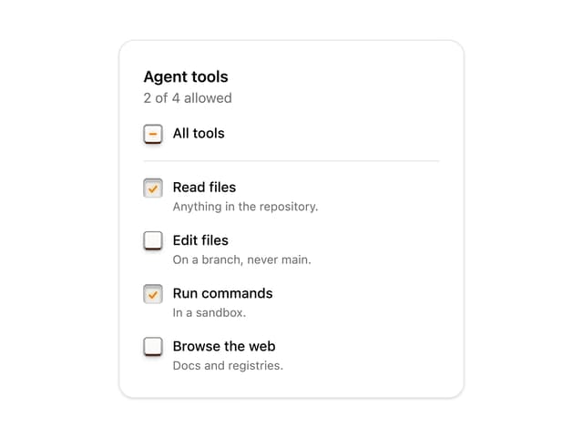
Latch checkbox