
About
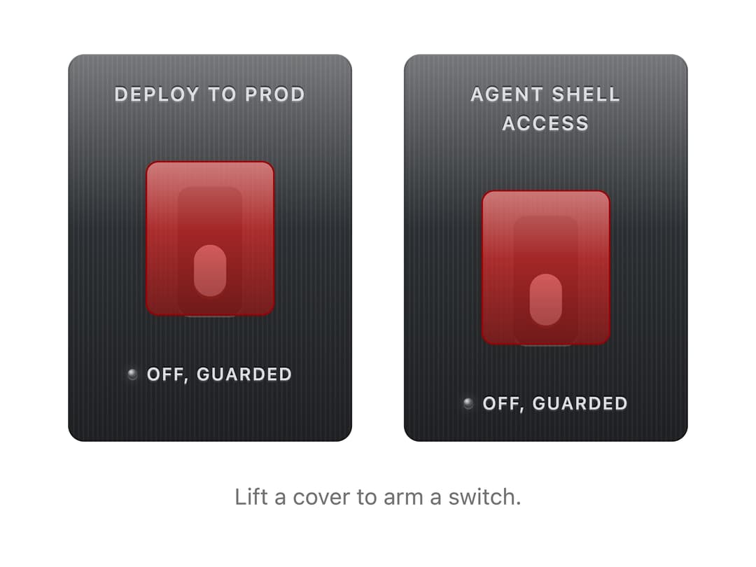
A critical switch under a flip-up cover, as in a cockpit. Lift the cover, then flip it; closing the cover returns it to safe, and the cover closes itself if left. Skeuomorphic, accessible, Base UI. Part of Bevel: bevel-ui.vercel.app
Built with React and Tailwind. Copy the prompt and paste it into Claude Code, Cursor or Lovable: your agent adds Guarded switch to your project and fits it to your theme.
Code
How Guarded switch is used: the demo's code. The component's own source comes with a free account.
Usage.tsx
"use client"

import * as React from "react"
import {
  GuardedSwitch,
  GuardedSwitchControl,
  GuardedSwitchLabel,
  GuardedSwitchStatus,
} from "@/components/ui/guarded-switch"

/** A critical switch under a flip cover. Lift the cover, then flip; walk away and the cover closes, turning it off. */
export function GuardedSwitchDeploy() {
  const [live, setLive] = React.useState(false)
  return (
    <div className="flex flex-col items-center gap-6">
      <div className="flex gap-8">
        <GuardedSwitch
          checked={live}
          onCheckedChange={setLive}
          autoClose={false}
        >
          <GuardedSwitchLabel>Deploy to prod</GuardedSwitchLabel>
          <GuardedSwitchControl />
          <GuardedSwitchStatus />
        </GuardedSwitch>
        <GuardedSwitch>
          <GuardedSwitchLabel>Agent shell access</GuardedSwitchLabel>
          <GuardedSwitchControl />
          <GuardedSwitchStatus />
        </GuardedSwitch>
      </div>
      <p className="text-sm text-muted-foreground">
        {live
          ? "Production deploys are live."
          : "Lift a cover to arm a switch."}
      </p>
    </div>
  )
}

export default GuardedSwitchDeploy
Dependencies
More by Hitesh
View all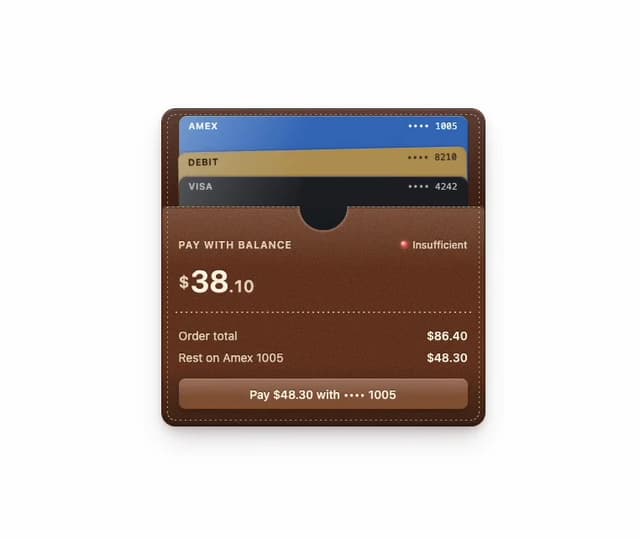
Wallet
8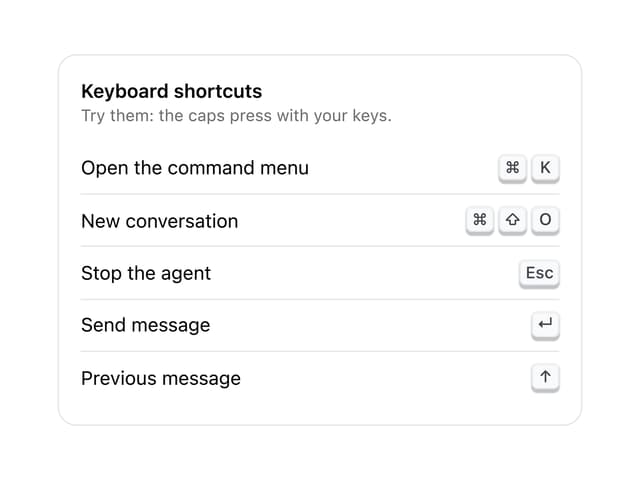
Kbd
4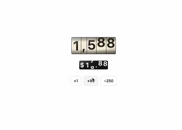
Number wheel
4
Badge
2
Icon key
1
Gauge and dial
Ledger
Preset keys