
About
A button made as a keycap: a cap with a lit top edge on a visible side, which travels down by the side's depth when pressed by pointer, Space or Enter. Skeuomorphic, accessible, Base UI. Part of Bevel: bevel-ui.vercel.app
Built with React and Tailwind. Copy the prompt and paste it into Claude Code, Cursor or Lovable: your agent adds Key to your project and fits it to your theme.
Code
How Key is used: the demo's code. The component's own source comes with a free account.
Usage.tsx
"use client"

import * as React from "react"
import { Key, KeyLamp } from "@/components/ui/key"

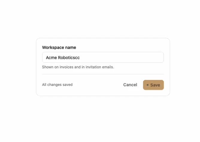
/** A settings form. Save latches down with its lamp lit while the request runs, then pops back up. */
export function KeyForm() {
  const [name, setName] = React.useState("Acme Robotics")
  const [saved, setSaved] = React.useState("Acme Robotics")
  const [saving, setSaving] = React.useState(false)
  const dirty = name.trim() !== saved

  async function save(event: React.FormEvent) {
    event.preventDefault()
    setSaving(true)
    await new Promise((resolve) => setTimeout(resolve, 1400))
    setSaved(name.trim())
    setSaving(false)
  }

  return (
    <form onSubmit={save} className="flex w-full max-w-md flex-col gap-4 rounded-xl border bg-card p-5">
      <div className="flex flex-col gap-1.5">
        <label htmlFor="workspace-name" className="text-sm font-medium">
          Workspace name
        </label>
        <input
          id="workspace-name"
          value={name}
          onChange={(event) => setName(event.target.value)}
          disabled={saving}
          className="h-9 rounded-md border bg-background px-3 text-sm outline-none focus-visible:ring-2 focus-visible:ring-ring"
        />
        <p className="text-xs text-muted-foreground">Shown on invoices and in invitation emails.</p>
      </div>
      <div className="flex items-center justify-end gap-2 border-t pt-4">
        <p role="status" className="mr-auto text-xs text-muted-foreground">
          {saving ? "Saving…" : dirty ? "Unsaved changes" : "All changes saved"}
        </p>
        <Key type="button" variant="ghost" disabled={!dirty || saving} onClick={() => setName(saved)}>
          Cancel
        </Key>
        <Key type="submit" pending={saving} disabled={!dirty}>
          <KeyLamp />
          Save
        </Key>
      </div>
    </form>
  )
}

export default KeyForm
Dependencies
More by Hitesh
View all
Wallet
8
Kbd
4
Number wheel
4
Badge
2
Icon key
1
Gauge and dial
Ledger
Preset keys