
About
A combo chart that mixes bars and a line series in one view, useful for comparing a volume metric like revenue against a trend metric like profit over time.
Built with React and Tailwind. Copy the prompt and paste it into Claude Code, Cursor or Lovable: your agent adds Composed Chart to your project and fits it to your theme.
Code
How Composed Chart is used: the demo's code. The component's own source comes with a free account.
Usage.tsx
"use client";

import EvilComposedChart from "@/components/ui/composed-chart";

const data = [
  { month: "Jan", revenue: 4200, profit: 1200 },
  { month: "Feb", revenue: 3800, profit: 980 },
  { month: "Mar", revenue: 5100, profit: 1750 },
  { month: "Apr", revenue: 4700, profit: 1600 },
  { month: "May", revenue: 6200, profit: 2100 },
  { month: "Jun", revenue: 5800, profit: 1950 },
];

const barConfig = {
  revenue: {
    label: "Revenue",
    colors: { light: ["#6366f1"], dark: ["#818cf8"] },
  },
};

const lineConfig = {
  profit: {
    label: "Profit",
    colors: { light: ["#f97316"], dark: ["#fb923c"] },
  },
};

export default function ComposedChartDemo() {
  return (
    <div className="w-full max-w-2xl p-6">
      <EvilComposedChart
        data={data}
        xDataKey="month"
        barConfig={barConfig}
        lineConfig={lineConfig}
        showLabels
      />
    </div>
  );
}
Dependencies
More by corr
View all

Audit Log
84
Stepper
59
Notice Alert
36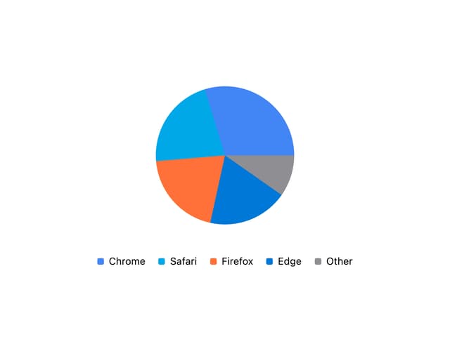
Pie Chart
8
Scroll Blur
8
Key Value List
7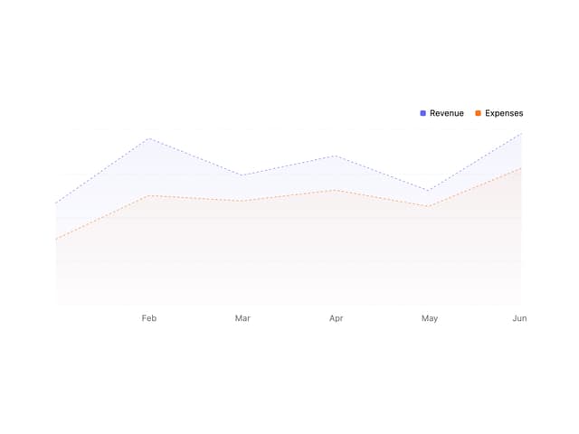
Area Chart
4
Animated Spinner
3
More in Dashboards
View all
Dashboard with Collapsible Sidebar
2.4K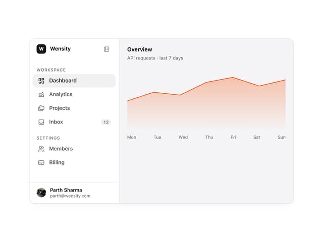

Sidebar
235

SaaS Template
2.4K
Stats Bento
1.1K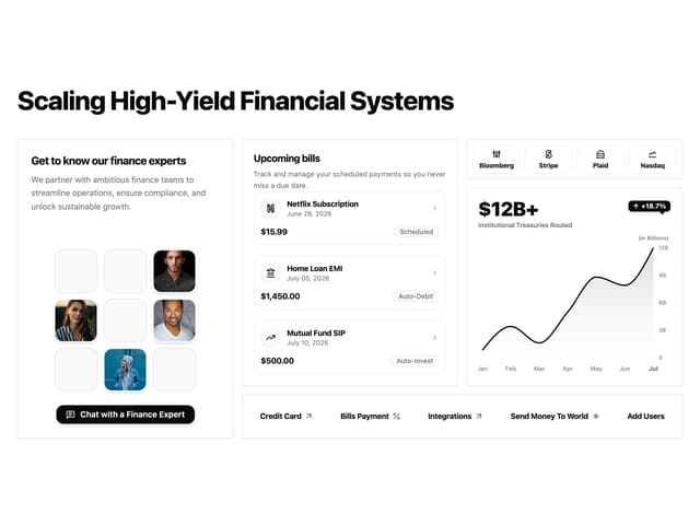

Financial Bento Grid
71
Stats cards with links
33

Course Design Cards
1.1K

Chat template
598


