About
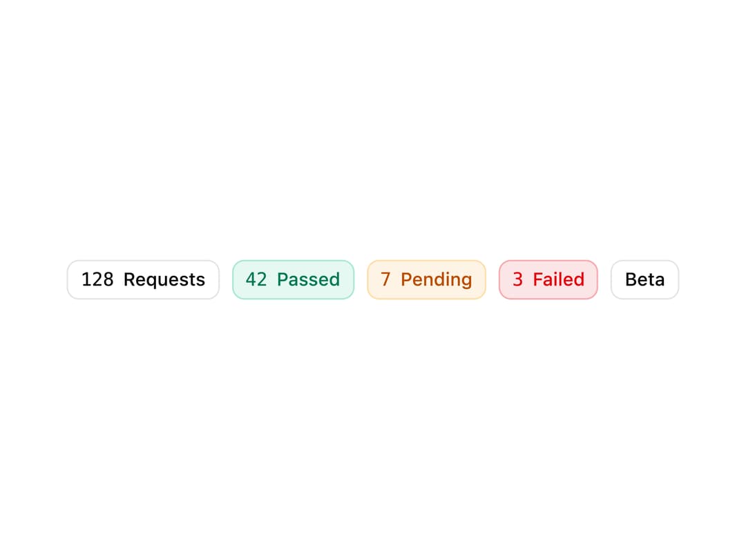
A small badge for displaying counts, states, and operational tags with semantic tones (neutral, success, warning, danger).
Built with React and Tailwind. Copy the prompt and paste it into Claude Code, Cursor or Lovable: your agent adds Metric Badge to your project and fits it to your theme.
Code
How Metric Badge is used: the demo's code. The component's own source comes with a free account.
Usage.tsx
import { MetricBadge } from "@/components/ui/metric-badge";

export default function MetricBadgeDemo() {
  return (
    <div className="flex flex-wrap items-center gap-2">
      <MetricBadge label="Requests" value={128} />
      <MetricBadge label="Passed" value={42} tone="success" />
      <MetricBadge label="Pending" value={7} tone="warning" />
      <MetricBadge label="Failed" value={3} tone="danger" />
      <MetricBadge label="Beta" tone="neutral" />
    </div>
  );
}
More by corr
View all

Audit Log
84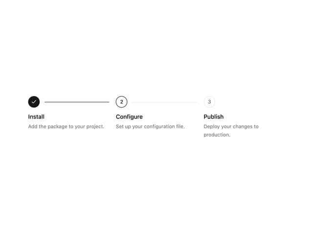
Stepper
59
Notice Alert
36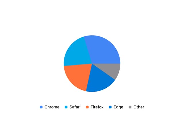
Pie Chart
8
Scroll Blur
8
Key Value List
7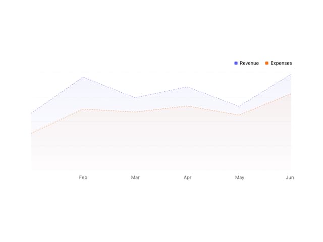
Area Chart
4
Animated Spinner
3