
About
A compact status badge with semantic color, icon, and label variants for operational interfaces.
Built with React and Tailwind. Copy the prompt and paste it into Claude Code, Cursor or Lovable: your agent adds Status Pill to your project and fits it to your theme.
Code
How Status Pill is used: the demo's code. The component's own source comes with a free account.
Usage.tsx
import { StatusPill } from "@/components/ui/status-pill";

export default function StatusPillDemo() {
  return (
    <div className="flex flex-wrap items-center gap-3">
      <StatusPill status="ready" />
      <StatusPill status="waiting" />
      <StatusPill status="issue" />
      <StatusPill status="ready" label="Deployed" />
    </div>
  );
}
Dependencies
More by corr
View all

Audit Log
84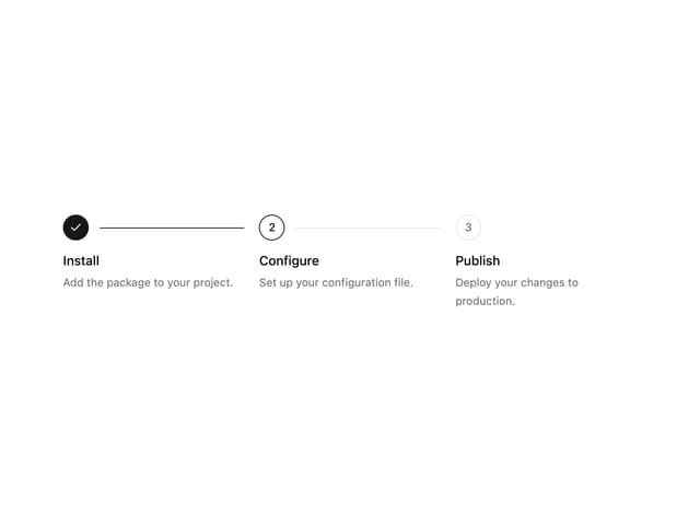
Stepper
59
Notice Alert
36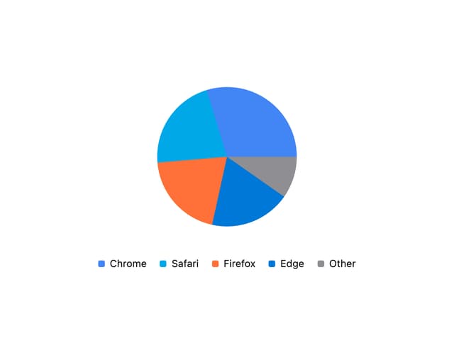
Pie Chart
8
Scroll Blur
8
Key Value List
7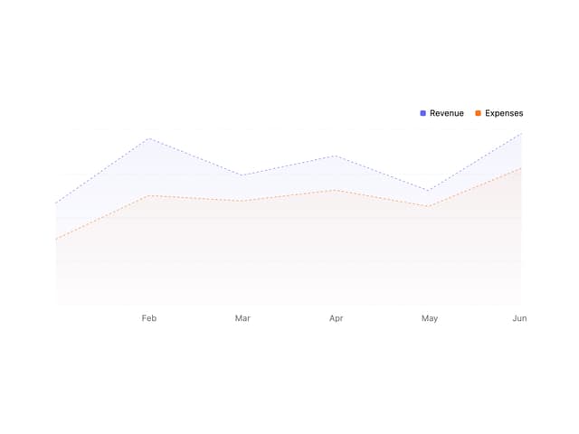
Area Chart
4
Animated Spinner
3