About
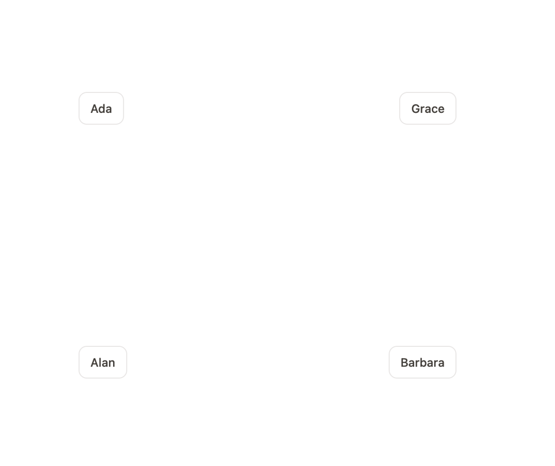
An accessible popover that anchors a floating panel to a trigger, auto-flips and clamps to stay in view, with a pointing arrow and spring-based open/close animation.
Built with React and Tailwind. Copy the prompt and paste it into Claude Code, Cursor or Lovable: your agent adds Popover to your project and fits it to your theme.
Code
How Popover is used: the demo's code. The component's own source comes with a free account.
Usage.tsx
"use client";

import { Popover } from "@/components/ui/popover";
import { useRef, useState } from "react";

const people = [
  {
    id: "tl",
    first: "Ada",
    name: "Ada Lovelace",
    role: "Layout engine",
    at: "left-3 top-3",
  },
  {
    id: "tr",
    first: "Grace",
    name: "Grace Hopper",
    role: "Compilers",
    at: "right-3 top-3",
  },
  {
    id: "bl",
    first: "Alan",
    name: "Alan Kay",
    role: "Research",
    at: "left-3 bottom-3",
  },
  {
    id: "br",
    first: "Barbara",
    name: "Barbara Liskov",
    role: "Platform",
    at: "right-3 bottom-3",
  },
];

export default function PopoverDemo() {
  const field = useRef<HTMLDivElement>(null);
  const [open, setOpen] = useState<string | null>(null);

  return (
    <div className="mx-auto h-[340px] w-full max-w-[440px]">
      <div ref={field} className="relative h-full w-full">
        {people.map((person) => (
          <div key={person.id} className={`absolute ${person.at}`}>
            <Popover
              label={`${person.name}, profile`}
              side="top"
              boundary={field}
              open={open === person.id}
              onOpenChange={(next) => setOpen(next ? person.id : null)}
              trigger={person.first}
            >
              <div className="w-[196px]">
                <p className="text-[13px] font-medium text-stone-700 dark:text-stone-100">
                  {person.name}
                </p>
                <p className="mt-0.5 text-[11.5px] text-stone-400 dark:text-stone-500">
                  {person.role} · joined 2019
                </p>
                <p className="mt-2 text-[12.5px] leading-relaxed text-stone-500 dark:text-stone-400">
                  Two reviews open. Last shipped the docs shell on Tuesday.
                </p>
              </div>
            </Popover>
          </div>
        ))}
      </div>
    </div>
  );
}
Dependencies
More by Özer
View all

Password Strength
1.3K
OTP Input
803
Loading Button
602
Progress Bar
588
Reorder List
310
Task Steps
276
Hold to Confirm
250
Reading Progress
169
More in Cards
View all
Stats cards with links
33

Course Design Cards
1.1K

Card
70
Statistics Card 2
264
Statistics Card 10
263

Card
17

Card Studio
9
The Item one
3
