
About
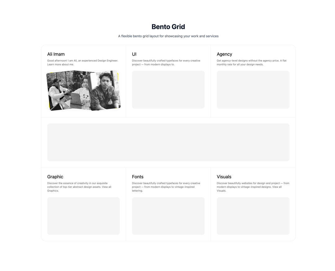
Bento Grid, Bento
Built with React and Tailwind. Copy the prompt and paste it into Claude Code, Cursor or Lovable: your agent adds Bento Grid to your project and fits it to your theme.
Code
How Bento Grid is used: the demo's code. The component's own source comes with a free account.
Usage.tsx
"use client"

import Image from "next/image"
import {
  BentoGridWithFeatures,
  type BentoFeature,
} from "@/components/ui/bento-grid"

const getTimeOfDayGreeting = () => {
  const hour = new Date().getHours()
  if (hour < 12) return "Good morning!"
  if (hour < 18) return "Good afternoon!"
  return "Good evening!"
}

export default function DemoOne() {
  const timeOfDayGreeting = getTimeOfDayGreeting()

  const features: BentoFeature[] = [
    {
      id: "1",
      title: "Ali Imam",
      description: `${timeOfDayGreeting} I am Ali, an experienced Design Engineer. Learn more about me.`,
      content: <SkeletonAbout />,
      className:
        "col-span-1 md:col-span-3 lg:col-span-2 border-b md:border-r dark:border-neutral-800",
    },
    {
      id: "2",
      title: "UI",
      description:
        "Discover beautifully crafted typefaces for every creative project — from modern displays to.",
      content: <div className="bg-accent mt-6 rounded-xl h-50 w-full" />,
      className:
        "col-span-1 md:col-span-3 lg:col-span-2 border-b lg:border-r dark:border-neutral-800",
    },
    {
      id: "3",
      title: "Agency",
      description:
        "Get agency-level designs without the agency price. A flat monthly rate for all your design needs.",
      content: <div className="bg-accent mt-6 rounded-xl h-50 w-full" />,
      className:
        "col-span-1 md:col-span-6 md:border-b lg:border-r-0 lg:col-span-2 border-b dark:border-neutral-800",
    },
    {
      id: "4",
      title: "",
      description: "",
      content: <div className="bg-accent rounded-xl h-50 w-full" />,
      className:
        "col-span-1 md:col-span-6 lg:col-span-6 border-b lg:border-r-0 dark:border-neutral-800",
    },
    {
      id: "5",
      title: "Graphic",
      description: `Discover the essence of creativity in our exquisite collection of top-tier abstract design assets. View all Graphics.`,
      content: <div className="bg-accent mt-6 rounded-xl h-50 w-full" />,
      className:
        "col-span-1 md:col-span-3 lg:col-span-2 md:border-r dark:border-neutral-800",
    },
    {
      id: "6",
      title: "Fonts",
      description:
        "Discover beautifully crafted typefaces for every creative project — from modern displays to vintage-inspired lettering.",
      content: <div className="bg-accent mt-6 rounded-xl h-50 w-full" />,
      className:
        "col-span-1 md:col-span-3 lg:col-span-2  lg:border-r dark:border-neutral-800",
    },
    {
      id: "7",
      title: "Visuals",
      description:
        "Discover beautifully websites for design and project — from modern displays to vintage-inspired designs. View all Visuals.",
      content: <div className="bg-accent mt-6 rounded-xl h-50 w-full" />,
      className:
        "col-span-1 md:col-span-6 lg:border-r-0 lg:col-span-2 dark:border-neutral-800",
    },
  ]

  return (
    <div>
      <div className="mb-8 text-center">
          <h1 className="mb-4 text-4xl font-bold text-gray-900 dark:text-gray-100">
            Bento Grid
          </h1>
          <p className="text-lg text-gray-600 dark:text-gray-400">
            A flexible bento grid layout for showcasing your work and services
          </p>
        </div>
        <BentoGridWithFeatures features={features} />
    </div>
  )
}

const SkeletonAbout = () => {
  return (
    <div className="flex items-center gap-4">
      <div className="group flex h-full w-full">
        <div className="relative mt-4 w-full">
          <div className="group inline-block w-full text-center">
            <div
              className="border-border-primary w-full rounded-xl border p-2 transition-all duration-500 ease-out group-hover:border-[#fff200]"
              style={{ height: 208 }}
            >
              <div
                className="grid h-full place-items-center rounded-lg border-2 border-[#fff200] bg-[#EDEEF0]"
                style={{ boxShadow: "10px 10px 1.5px 0px #fff200 inset" }}
              ></div>
            </div>
          </div>
          <Image
            src="https://cdn.21st.dev/assets/mirror/e4/e4d71432d5fe31c97a041483b8ed839dc4ebdcb7594cd33b57f29fe0b2c1a7af.jpg"
            alt="ali"
            width={300}
            height={300}
            className="absolute top-1 left-1 h-[200px] w-40 -rotate-[6deg] rounded-lg object-cover shadow-sm transition-all duration-500 group-hover:scale-95 group-hover:rotate-[0deg]"
          />
          <Image
            src="https://cdn.21st.dev/assets/mirror/7a/7a40b7519bd0d424127db9cbb14753c630ee0542e36e1ced83d7922b0db6ed50.jpg"
            alt="ali"
            width={300}
            height={300}
            className="absolute top-1 right-24 h-[200px] w-40 rotate-[5deg] rounded-lg object-cover shadow-sm transition-all duration-500 group-hover:scale-95 group-hover:rotate-[0deg]"
          />
          <Image
            src="https://cdn.21st.dev/assets/mirror/16/16565d5bddfd54609648485239f883989e96e41688e9f18b7ac4060c22353d90.jpg"
            alt="ali"
            width={300}
            height={300}
            className="absolute top-1 right-1 h-[200px] w-40 -rotate-[6deg] rounded-lg object-cover shadow-sm transition-all duration-500 group-hover:scale-95 group-hover:rotate-[0deg]"
          />
        </div>
      </div>
    </div>
  )
}
More by Ali Imam
View all

Liquid Glass Button
6.7K
Shader Animation
3.7K
WebGL Shader
2.6K
Shader Lines
2.3K
Shiny Button
2.2K
GLSL Hills
2.1K
Canvas
1.8K
Glowing Shadow
1.5K
More in Features
View all

Features 8
3.1K

Feature Sections
107

Grid Feature Cards
1.9K

Feature 72
122
Features 2
322
Features 4
368
Feature Modern
9
Features Card
201

