
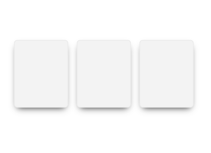
advanced React component designed to create an engaging and modern card interface. It features a unique spotlight glow effect that intelligently tracks the mouse pointer across the screen, highlighting the card with a configurable hue. Part of the EaseMize UI library, it supports several preset glow colors, predefined responsive sizes ('sm', 'md', 'lg'), and allows for completely custom dimensions via width, height, or className props. The underlying CSS leverages custom properties for a highly dynamic and performant visual effect.
Built with React and Tailwind. Copy the prompt and paste it into Claude Code, Cursor or Lovable: your agent adds Spotlight Card to your project and fits it to your theme.
Code
How Spotlight Card is used: the demo's code. The component's own source comes with a free account.
Usage.tsx
import { GlowCard } from "@/components/ui/spotlight-card";

export function Default(){
  return(
    <div className="w-screen h-screen flex flex-row items-center justify-center gap-10 custom-cursor">
      <GlowCard />
      <GlowCard />
      <GlowCard />
    </div>
  );
};More by Hossain Jahed
View all

Cinematic landing Hero
5.6K
Motion Footer
5.6K
Sign In
4.6K
AI prompt Box
3K
Glassmorphism Trust Hero
2.8K
Limelight Nav
2K
Ai chat input
1.7K
Flow Field Background
1.5K
More in Cards
View all

Statistics Card 2
263
Stats cards with links
39
Card
70

Course Design Cards
1.1K
The Item one
3

Card Studio
7
Statistics Card 7
292

Item
10
