
About
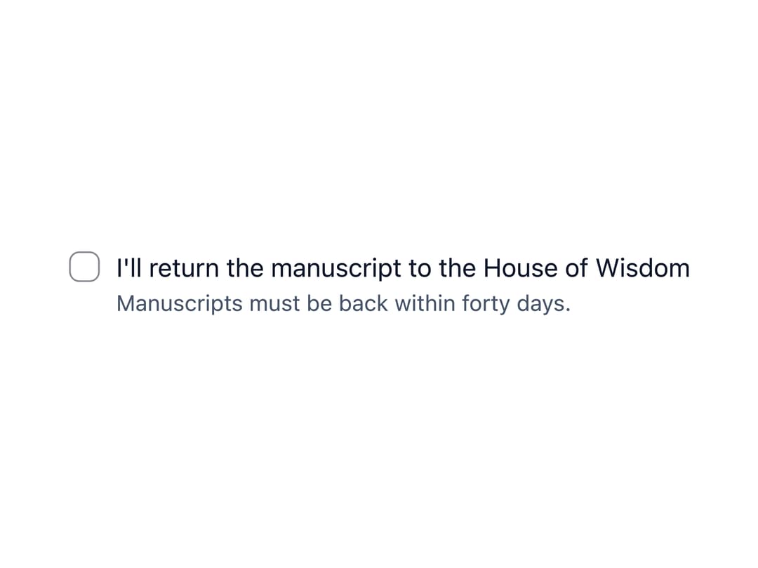
An accessible checkbox input with a label, optional hint/error text, and an indeterminate "select all" state for parent/child selections in forms.
Built with React and Tailwind. Copy the prompt and paste it into Claude Code, Cursor or Lovable: your agent adds Checkbox to your project and fits it to your theme.
Code
How Checkbox is used: the demo's code. The component's own source comes with a free account.
Usage.tsx
"use client";

import * as React from "react";
import Checkbox from "@/components/ui/checkbox";

export default function CheckboxDemo() {
  const [agreed, setAgreed] = React.useState(false);

  return (
    <Checkbox
      checked={agreed}
      onChange={(e) => setAgreed(e.target.checked)}
      hint="Manuscripts must be back within forty days."
    >
      I'll return the manuscript to the House of Wisdom
    </Checkbox>
  );
}
Dependencies
More by ebnsina
View all
Countdown Timer
20
Video Player
15
Alarm Clock
14
Voice Note
12
Split Button
11
Sortable List
9
Stopwatch
5
Code Block
4
More in Forms
View all

Premium Auth
495
Authentication Card
44

Login 1
52

Login 2
7

Form
32

Card Studio
41

Form
136

Login Card
32
