

About
A compound tabs component with a sliding active-tab indicator, a gliding hover highlight, roving-tabindex keyboard navigation and scroll-fade edges, for switching between panels of related content.
Built with React and Tailwind. Copy the prompt and paste it into Claude Code, Cursor or Lovable: your agent adds Tabs to your project and fits it to your theme.
Code
How Tabs is used: the demo's code. The component's own source comes with a free account.
Usage.tsx
"use client";

import Tabs from "@/components/ui/tabs";
import { useState } from "react";

export default function TabsDemo() {
  const [scholar, setScholar] = useState("ibn-sina");

  return (
    <Tabs value={scholar} onValueChange={setScholar}>
      <Tabs.List label="Scholars">
        <Tabs.Tab value="ibn-sina">Ibn Sina</Tabs.Tab>
        <Tabs.Tab value="khwarizmi">Al-Khwarizmi</Tabs.Tab>
        <Tabs.Tab value="biruni" disabled>
          Al-Biruni
        </Tabs.Tab>
        <Tabs.Tab value="fihri">Fatima al-Fihri</Tabs.Tab>
      </Tabs.List>
      <Tabs.Panel value="ibn-sina">
        The Canon of Medicine, taught in Europe's medical schools for centuries.
      </Tabs.Panel>
      <Tabs.Panel value="khwarizmi">
        Al-Jabr gave algebra its name, solving problems like{" "}
        <code>x² + 10x = 39</code>.
      </Tabs.Panel>
      <Tabs.Panel value="biruni">
        Measured the radius of the Earth from a mountaintop.
      </Tabs.Panel>
      <Tabs.Panel value="fihri">
        Founded al-Qarawiyyin in Fez in 859, still teaching today.
      </Tabs.Panel>
    </Tabs>
  );
}
More by ebnsina
View all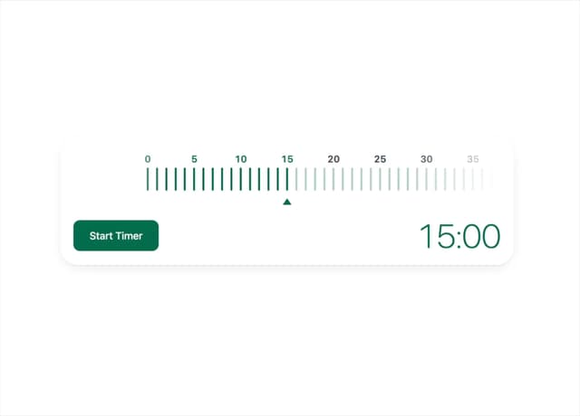
Countdown Timer
20
Video Player
15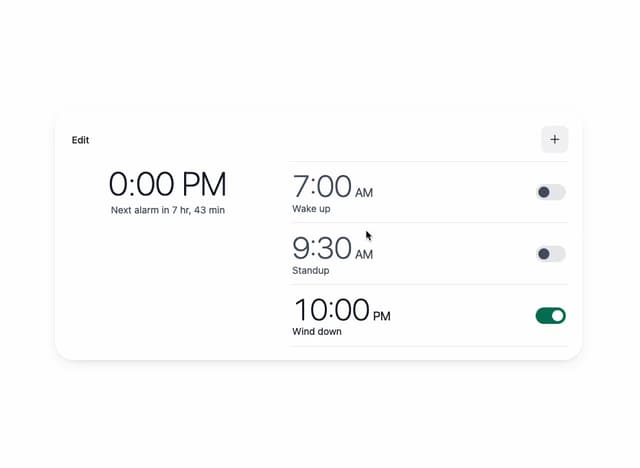
Alarm Clock
14
Voice Note
12
Split Button
11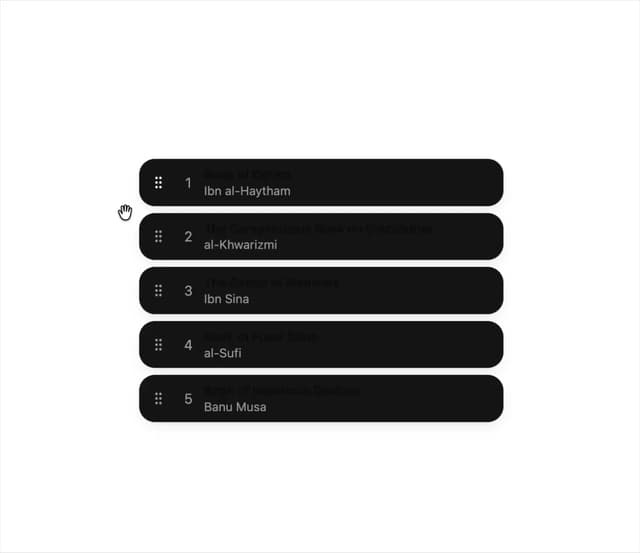
Sortable List
9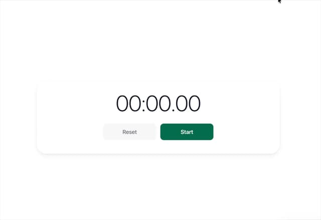
Stopwatch
5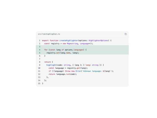
Code Block
4
More in Navigation
View all

Sidebar
225

Tabs
52
Navbar with Theme Toggle
40

Breadcrumb
12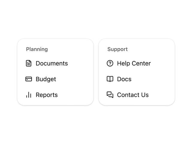
Nav List Card
30
Pagination Ant
3

Pagination
85
Pagination
9


