

About
A small popover panel that appears when hovering (or focusing) a trigger element, used to preview extra details like a customer summary or a person's profile without navigating away.
Built with React and Tailwind. Copy the prompt and paste it into Claude Code, Cursor or Lovable: your agent adds Hover Card to your project and fits it to your theme.
Code
How Hover Card is used: the demo's code. The component's own source comes with a free account.
Usage.tsx
import HoverCard from "@/components/ui/hover-card";
import {
  Avatar,
  Stack,
  Text,
} from "@/components/ui/hover-card-utils/kit-extras";

export default function HoverCardPersonDemo() {
  return (
    <div
      style={{
        display: "flex",
        alignItems: "center",
        justifyContent: "center",
        minHeight: 220,
        padding: 40,
      }}
    >
      <HoverCard trigger={<Avatar name="Dana Ruiz" />}>
        <Stack direction="row" gap={12} align="center">
          <Avatar name="Dana Ruiz" size={40} />
          <Stack gap={2}>
            <Text weight="medium">Dana Ruiz</Text>
            <Text size="sm" secondary>
              Support lead, on call this week
            </Text>
          </Stack>
        </Stack>
      </HoverCard>
    </div>
  );
}
More by halaska-studio
View all
Dot Grid
24
Orb
15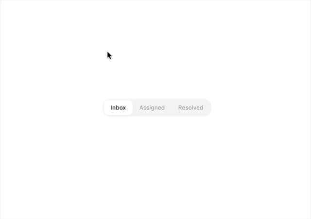
Segmented Control
8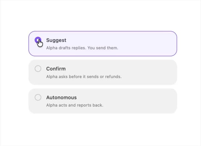
Choicebox
6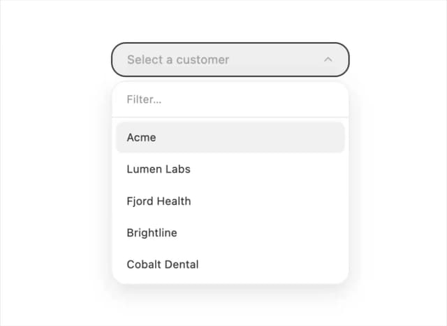
Combobox
5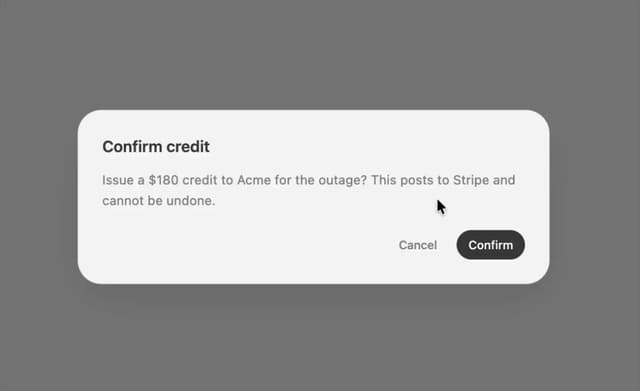
Dialog
4
Input OTP
4
Table
2
More in Cards
View all

Statistics Card 2
264

Course Design Cards
1.1K
Card
70
Stats cards with links
39
The Item one
3

Card Studio
7
Statistics Card 7
292

Item
10
