About
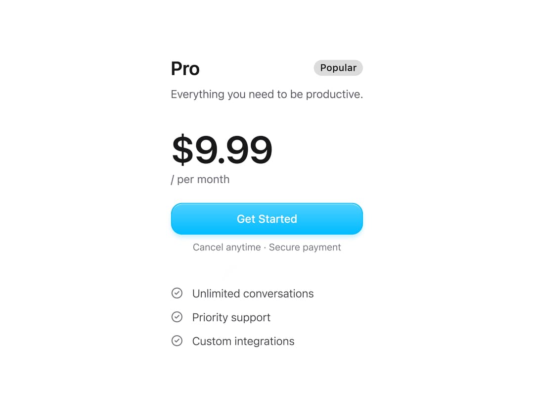
A glassmorphism-style pricing plan card with price display, feature list with icons, popular/current-plan badges, and a call-to-action button for subscription or SaaS pricing pages.
Built with React and Tailwind. Copy the prompt and paste it into Claude Code, Cursor or Lovable: your agent adds Pricing Card to your project and fits it to your theme.
Code
How Pricing Card is used: the demo's code. The component's own source comes with a free account.
Usage.tsx
import { PricingCard } from "@/components/ui/pricing-card";

export default function PricingCardDemo() {
  return (
    <div className="flex items-center justify-center p-8">
      <div className="w-full max-w-sm">
        <PricingCard
          title="Pro"
          price={9.99}
          description="Everything you need to be productive."
          features={[
            "Unlimited conversations",
            "Priority support",
            "Custom integrations",
          ]}
          isPopular
          onButtonClick={() => console.log("Selected!")}
        />
      </div>
    </div>
  );
}
More by heygaia
View all

Tool Calls Section
401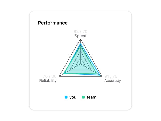
Radar Chart
47
Wave Spinner
21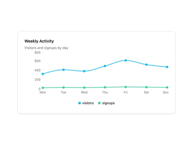
Line Chart
12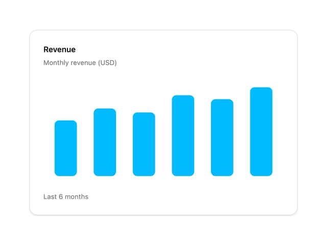
Bar Chart
12
Knowledge Graph
6
Pie Chart
6
Scatter Chart
5
More in Pricing
View all
Pricing Section
582

Pricing Section
173

Pricing Card
365
pricing section
158

Pricing Cards
86
Colorful-Pricing
85
Glowing Pricing Tiers
45

RuixenPricing05
102


