
About
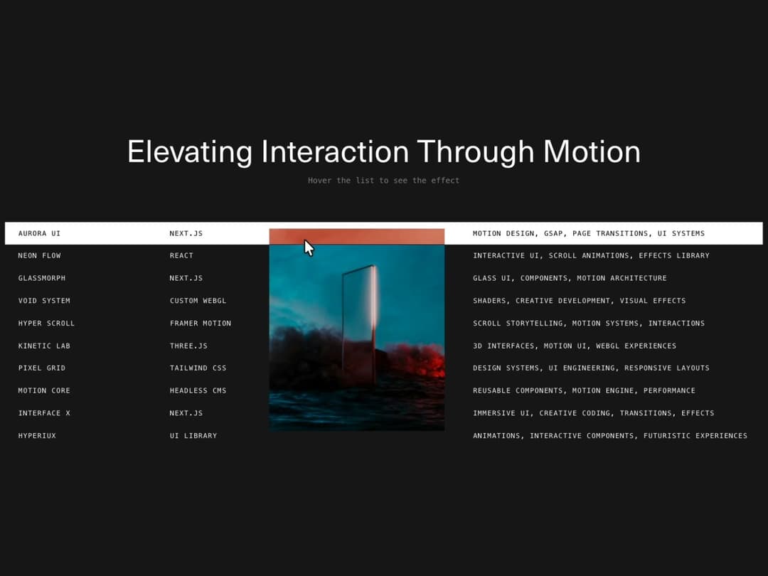
Hover-driven list where each row reveals a clipped preview image with a sliding highlight bar and a mix-blend-mode difference inversion. Pointer-type aware, respects reduced motion.
Built with React and Tailwind. Copy the prompt and paste it into Claude Code, Cursor or Lovable: your agent adds Interactive List Preview to your project and fits it to your theme.
Code
How Interactive List Preview is used: the demo's code. The component's own source comes with a free account.
Usage.tsx
"use client";

import InteractiveListPreview from "@/components/ui/interactive-list-preview";

export default function InteractiveListPreviewDemo() {
  return (
    <div className="flex h-screen w-full flex-col items-center justify-center gap-16 bg-neutral-900 px-4 max-[1025px]:h-auto max-[1025px]:py-16">
      <div className="space-y-3 text-center">
        <h2 className="font-mono text-[4vw] capitalize text-white max-[1025px]:text-4xl">
          Elevating interaction through motion
        </h2>
        <p className="font-mono text-sm text-white/50">Hover the list to see the effect</p>
      </div>

      <InteractiveListPreview />
    </div>
  );
}
Dependencies
More by Hyperiux Vault
View all

Product Timeline
2.2K
Stack Spread
1.3K
Arrow Fill Button
908
Shiny Button
733
Circular Split Roll
632
Zoom Slider
423
Stack Loader
370
Metallic Button
320
More in Forms
View all

Premium Auth
495
Authentication Card
44

Login 1
52

Login 2
7

Form
32

Card Studio
41

Form
136

Login Card
32
