
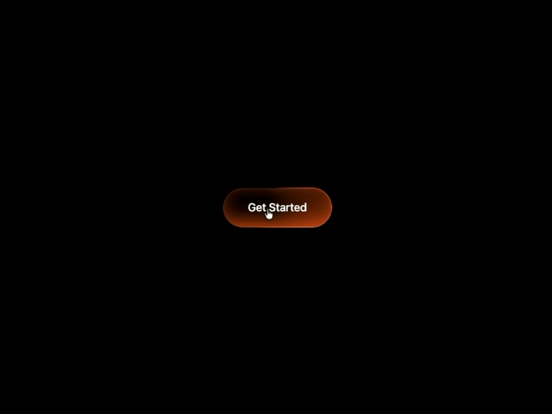
About
Button with a rotating conic-gradient border, masked dot pattern, and inner shimmer that intensifies on hover. Pure CSS, zero dependencies.
Built with React and Tailwind. Copy the prompt and paste it into Claude Code, Cursor or Lovable: your agent adds Shiny Button to your project and fits it to your theme.
Code
How Shiny Button is used: the demo's code. The component's own source comes with a free account.
Usage.tsx
"use client";

import ShinyButton from "@/components/ui/shiny-button";

export default function ShinyButtonDemo() {
  return (
    <main className="flex min-h-screen w-full items-center justify-center bg-black">
      <ShinyButton label="Get Started" />
    </main>
  );
}
More by Hyperiux Vault
View all

Product Timeline
2.3K
Stack Spread
1.3K
Arrow Fill Button
912
Interactive List Preview
869
Circular Split Roll
641
Zoom Slider
430
Stack Loader
371
Metallic Button
327
More in Buttons
View all

Button
14
Button
34
Texture Button
92
Button Save
46

Button
64

Button Group
3

App Store Button
454

Notification Button
103

