
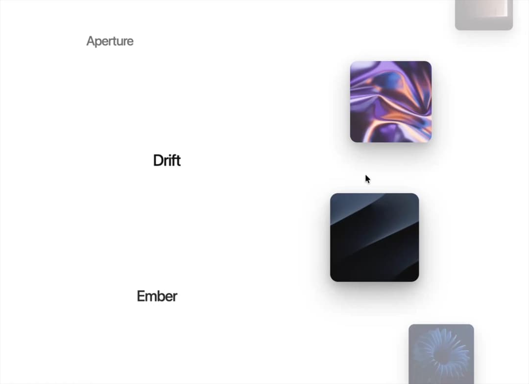
About
Scroll-pinned split gallery: titles orbit one circular path while image cards orbit another, each item easing into focus at the centre. Theme-aware, reduced-motion fallback grid, fully prop-driven.
Built with React and Tailwind. Copy the prompt and paste it into Claude Code, Cursor or Lovable: your agent adds Circular Split Roll to your project and fits it to your theme.
Code
How Circular Split Roll is used: the demo's code. The component's own source comes with a free account.
Usage.tsx
"use client";

import CircularSplitRoll from "@/components/ui/circular-split-roll";

// Component paints the theme background/foreground out of the box.
// Pass `background` / `titleColor` to pin it to a specific palette.
export default function CircularSplitRollDemo() {
  return (
    <CircularSplitRoll
      radius={500}
      cardSize={205}
      textSideScale={0.68}
      textSideOpacity={0.18}
    />
  );
}
Dependencies
More by Hyperiux Vault
View all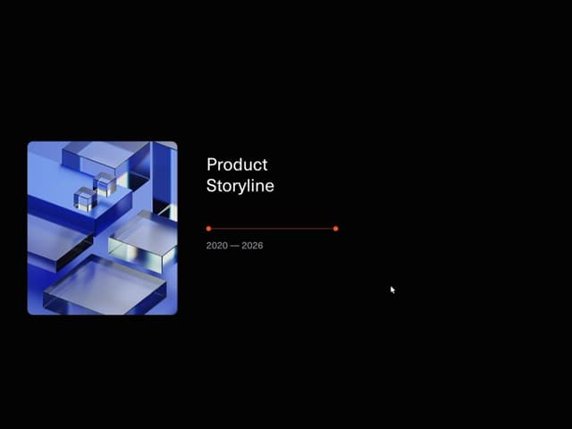

Product Timeline
2.3K
Stack Spread
1.3K
Arrow Fill Button
911
Interactive List Preview
867
Shiny Button
741
Zoom Slider
428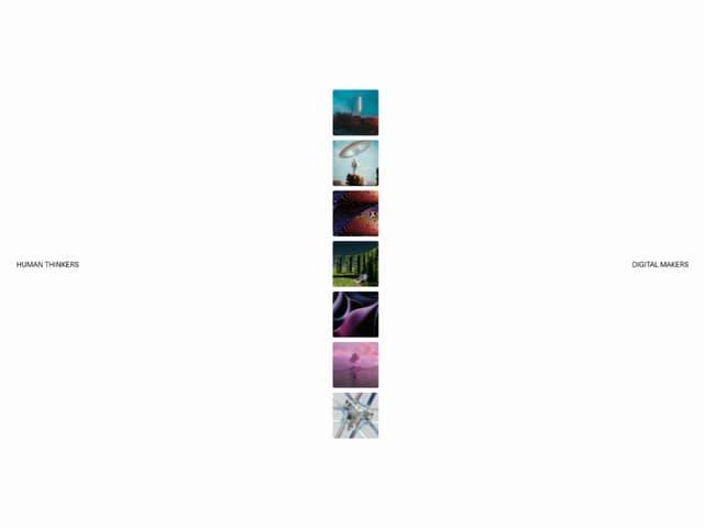
Stack Loader
371
Metallic Button
323
More in Galleries
View all
Thumbnail image viewer
41

Animated Gallery
1.4K

Hero Section 6
881
Editorial Collage Hero
428
3D Parallax Unfurling Gallery
975
Layout Grid
823

File Upload
18

Tilted Grid Hero
1.4K


