
About
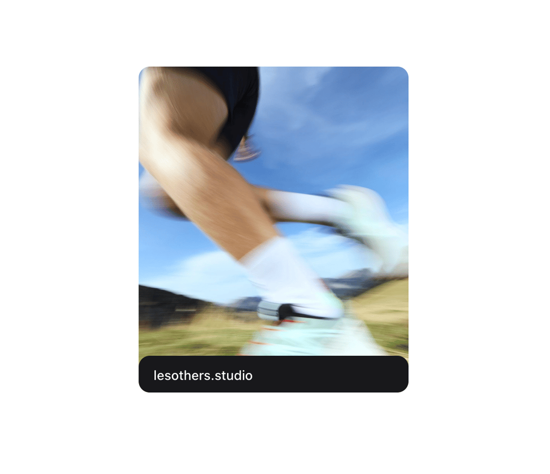
The Disclosure component allows users to toggle the visibility of content, either collapsed or expanded.
Built with React and Tailwind. Copy the prompt and paste it into Claude Code, Cursor or Lovable: your agent adds Disclosure to your project and fits it to your theme.
Code
How Disclosure is used: the demo's code. The component's own source comes with a free account.
Usage.tsx
"use client";

import { useState } from "react";
import { motion } from "framer-motion";
import {
  Disclosure,
  DisclosureContent,
  DisclosureTrigger,
} from "@/components/ui/disclosure";


function DisclosureCard() {
  const [isOpen, setIsOpen] = useState(false);

  const imageVariants = {
    collapsed: { scale: 1, filter: "blur(0px)" },
    expanded: { scale: 1.1, filter: "blur(3px)" },
  };

  const contentVariants = {
    collapsed: { opacity: 0, y: 0 },
    expanded: { opacity: 1, y: 0 },
  };

  const transition = {
    type: "spring",
    stiffness: 26.7,
    damping: 4.1,
    mass: 0.2,
  };

  return (
    <div className="relative h-[350px] w-[290px] overflow-hidden rounded-xl">
      <div onClick={() => setIsOpen(!isOpen)}>
        <motion.img
          src="https://images.beta.cosmos.so/5b21c112-ed1d-45cd-baf0-38186a15af8e?format=jpeg"
          alt="Les others studio - Que la montagne est belle ⛰"
          className="pointer-events-none h-auto w-full select-none"
          animate={isOpen ? "expanded" : "collapsed"}
          variants={imageVariants}
          transition={transition}
        />
      </div>
      <Disclosure
        onOpenChange={setIsOpen}
        open={isOpen}
        className="absolute bottom-0 left-0 right-0 rounded-xl bg-zinc-900 px-4 pt-2 dark:bg-zinc-50"
        variants={contentVariants}
        transition={transition}
      >
        <DisclosureTrigger>
          <button
            className="w-full pb-2 text-left text-[14px] font-medium text-white dark:text-zinc-900"
            type="button"
            onClick={() => setIsOpen(!isOpen)}
          >
            lesothers.studio
          </button>
        </DisclosureTrigger>
        <DisclosureContent>
          <div className="flex flex-col pb-4 text-[13px] text-zinc-300 dark:text-zinc-700">
            <p>How beautiful the mountain is 🗻</p>
            <p className="line-clamp-3">
              The “This is trail running” campaign highlights the new trail
              collection from <strong className="font-medium">@salomon</strong>,
              trying to touch the (strong) sensations experienced by runners.
              With each model, its natural environment. To capture the Pulsar
              Trail Pro 2 in real conditions, we chose to take the athletes
              trudging in the French Alps, at 2,000 meters altitude.
            </p>
            <button
              className="mt-3 w-full rounded-[4px] border border-zinc-700 bg-zinc-900 px-4 py-1 text-zinc-50 transition-colors duration-300 hover:bg-zinc-800"
              type="button"
            >
              Learn More
            </button>
          </div>
        </DisclosureContent>
      </Disclosure>
    </div>
  );
}

export { DisclosureCard };
Dependencies
More by Julien Thibeaut
View all

Dock
3.1K
Text Effect
1.6K
Infinite Slider
1.5K
Text Shimmer
1.3K
Text Scramble
1.1K
Progressive blur
683
Glow Effect
610
Tailwind CSS Background Snippet
536
More in Cards
View all
Stats cards with links
33

Course Design Cards
1.1K

Card
70
Statistics Card 2
264
Statistics Card 10
263

Card
17

Card Studio
9
The Item one
3
