About
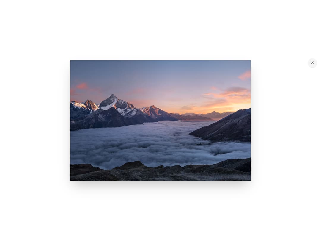
Click-to-zoom image component with a medium.com-style lightbox that expands on click and closes on scroll.
Built with React and Tailwind. Copy the prompt and paste it into Claude Code, Cursor or Lovable: your agent adds Zoomable Image to your project and fits it to your theme.
Code
How Zoomable Image is used: the demo's code. The component's own source comes with a free account.
Usage.tsx
import ZoomableImage from "@/components/ui/zoomable-image";

export default function Default() {
  return (
    <div className="flex flex-col items-center gap-3 p-8">
      <p className="text-sm text-muted-foreground">
        click the image to zoom in, click again or scroll to close.
      </p>
      <ZoomableImage
        src="https://cdn.21st.dev/assets/mirror/ca/ca905300194e1d0ffc3223cfd3ba226477f36706c5461ffcd97c6f9e15344b8e.jpg"
        alt="A beautiful landscape"
        className="rounded-lg w-full max-w-md"
      />
    </div>
  );
}
Dependencies
More by inference-sh
View all
Sidebar Light
33
YouTube Embed
32
Table of Contents
13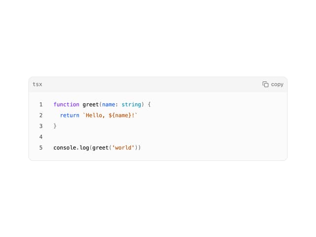
Code Block
4
Virtualized List
More in Galleries
View all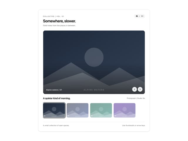
Thumbnail image viewer
43

Animated Gallery
1.4K

File Upload
18
Editorial Collage Hero
431
3D Parallax Unfurling Gallery
981

Image Gallery
123

Elastic Gallery
908

Tilted Grid Hero
1.5K

