
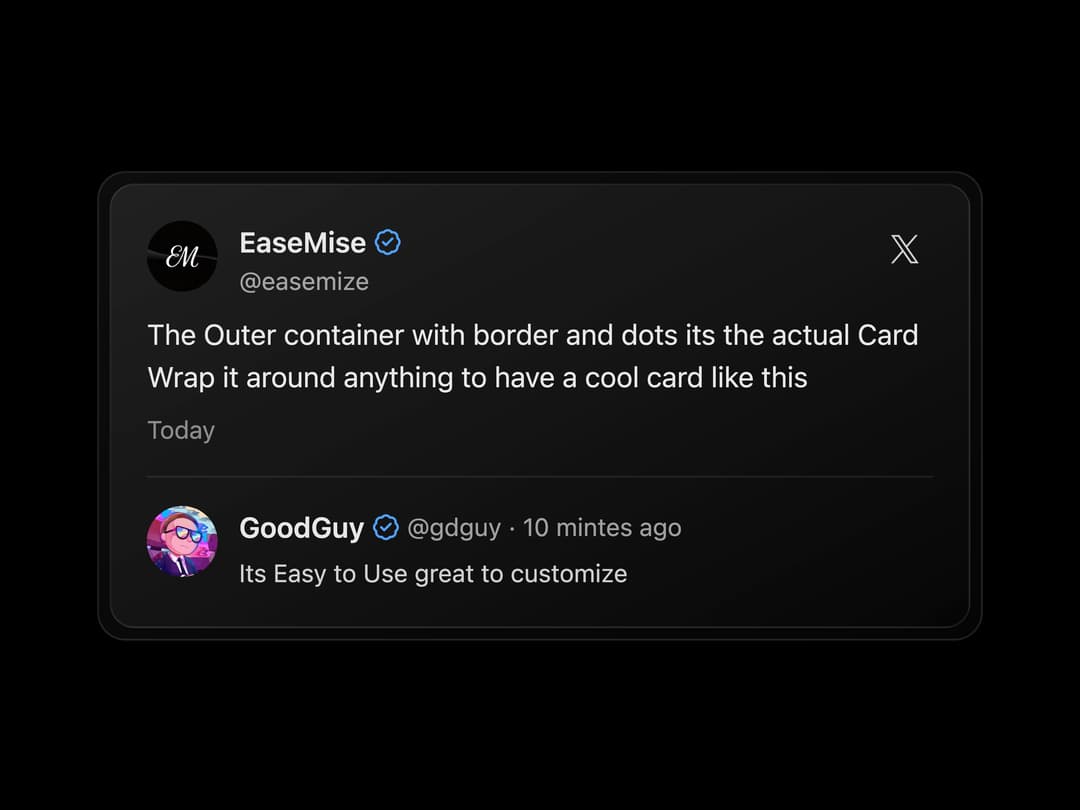
A React component that renders a visually striking card with an animated, glowing border effect. This component uses an SVG filter (feColorMatrix) to achieve the customizable glow, enhancing UI elements with a modern and interactive feel. It includes a CardCanvas to house the SVG filter definition and a Card component for the main content display, complete with border elements. Ideal for drawing attention to featured content, calls to action, or simply adding a touch of dynamic visual flair to your application.
Built with React and Tailwind. Copy the prompt and paste it into Claude Code, Cursor or Lovable: your agent adds Animated Glow Card to your project and fits it to your theme.
Code
How Animated Glow Card is used: the demo's code. The component's own source comes with a free account.
Usage.tsx
import { Card, CardCanvas } from "@/components/ui/animated-glow-card";
import { XCard } from "@/components/ui/animated-glow-card-utils/x-gradient-card";

const XCardDummyData = {
  authorName: "EaseMise",
  authorHandle: "easemize",
  authorImage:
    "https://cdn.21st.dev/assets/localized/439bd960e78d5173dc39f9e5f98086227274d7025218c6bc9802c3d065260902.jpg",
  content: [
    "The Outer container with border and dots its the actual Card",
    "Wrap it around anything to have a cool card like this",
  ],
  isVerified: true,
  timestamp: "Today",
  reply: {
    authorName: "GoodGuy",
    authorHandle: "gdguy",
    authorImage:
      "https://cdn.21st.dev/assets/mirror/e9/e941f86e0ca2b1c9eefd47618a92040443f85598470bad47399cee7f259c0756.jpg",
    content: "Its Easy to Use great to customize",
    isVerified: true,
    timestamp: "10 mintes ago",
  },
};

function XCardDemoDefault() {
  return <XCard {...XCardDummyData} />;
}

function DemoOne() {
  return (
    <div className="flex w-full h-screen justify-center items-center bg-black">
      <CardCanvas>
        <Card className="w-auto p-6">
          <div className="dark">
            <XCard {...XCardDummyData} />
          </div>
        </Card>
      </CardCanvas>
    </div>
  );
}

export { DemoOne };

export default DemoOne;
More by Hossain Jahed
View all

Spotlight Card
8.7K
Cinematic landing Hero
5.6K
Motion Footer
5.6K
Sign In
4.6K
AI prompt Box
3K
Glassmorphism Trust Hero
2.8K
Limelight Nav
2K
Ai chat input
1.7K
More in Cards
View all

Statistics Card 2
263
Card
70
Stats cards with links
39

Course Design Cards
1.1K
The Item one
3

Card Studio
7
Statistics Card 7
290

Item
10
