
About
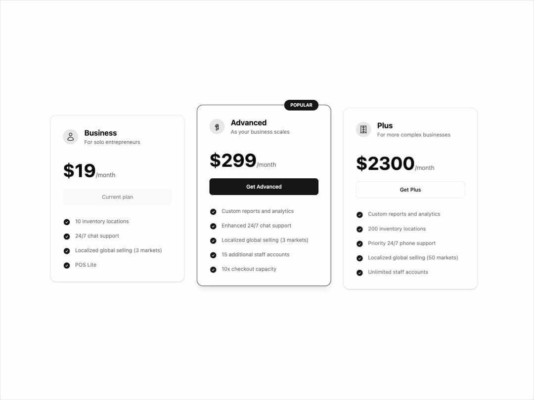
Pricing Card Component This component is designed to be highly reusable and customizable through props. It uses framer-motion for animations, cva for handling style variants (like the "popular" state), and shadcn/ui theme variables for seamless light and dark mode support.
Built with React and Tailwind. Copy the prompt and paste it into Claude Code, Cursor or Lovable: your agent adds Price to your project and fits it to your theme.
Code
How Price is used: the demo's code. The component's own source comes with a free account.
Usage.tsx
'use client';

import { PricingCard } from '@/components/ui/price';
import { motion } from 'framer-motion';

// --- ICONS for the demo ---
const RocketIcon = () => (
  <svg xmlns="http://www.w3.org/2000/svg" fill="none" viewBox="0 0 24 24" strokeWidth={1.5} stroke="currentColor" className="w-6 h-6">
    <path strokeLinecap="round" strokeLinejoin="round" d="M15.59 14.37a6 6 0 01-5.84 7.38v-4.82m5.84-2.56v4.82a6 6 0 01-1.83-1.01l-4.01-4.01a6 6 0 01-1.01-1.83H7.5a6 6 0 017.38-5.84zM10.5 14.5L14 11m-3.5 3.5v-4.5h4.5" />
  </svg>
);
const UserIcon = () => (
  <svg xmlns="http://www.w3.org/2000/svg" fill="none" viewBox="0 0 24 24" strokeWidth={1.5} stroke="currentColor" className="w-6 h-6">
    <path strokeLinecap="round" strokeLinejoin="round" d="M15.75 6a3.75 3.75 0 11-7.5 0 3.75 3.75 0 017.5 0zM4.501 20.118a7.5 7.5 0 0114.998 0A17.933 17.933 0 0112 21.75c-2.676 0-5.216-.584-7.499-1.632z" />
  </svg>
);
const BuildingIcon = () => (
  <svg xmlns="http://www.w3.org/2000/svg" fill="none" viewBox="0 0 24 24" strokeWidth={1.5} stroke="currentColor" className="w-6 h-6">
    <path strokeLinecap="round" strokeLinejoin="round" d="M3.75 21h16.5M4.5 3h15M5.25 3v18m13.5-18v18M9 6.75h6.375M9 12h6.375m-6.375 5.25h6.375M5.25 6.75h.008v.008H5.25V6.75zm.008 5.25h.008v.008H5.25v-.008zm0 5.25h.008v.008H5.25v-.008zm13.5-5.25h.008v.008h-.008v-.008zm0 5.25h.008v.008h-.008v-.008zM12 21V3" />
  </svg>
);


// --- FADE-IN ANIMATION VARIANTS ---
const containerVariants = {
  hidden: {},
  visible: {
    transition: {
      staggerChildren: 0.2, // Stagger the animation of children
    },
  },
};

const itemVariants = {
  hidden: { opacity: 0, y: 20 },
  visible: {
    opacity: 1,
    y: 0,
    transition: {
      duration: 0.5,
      ease: 'easeOut',
    },
  },
};

export default function PricingPageDemo() {
  return (
    <div className="w-full max-w-6xl mx-auto py-12 px-4">
      <motion.div
        className="grid grid-cols-1 md:grid-cols-2 lg:grid-cols-3 gap-8 items-center"
        variants={containerVariants}
        initial="hidden"
        animate="visible"
      >
        {/* --- Business Plan --- */}
        <motion.div variants={itemVariants}>
          <PricingCard
            planName="Business"
            description="For solo entrepreneurs"
            price={19}
            billingCycle="/month"
            features={[
              '10 inventory locations',
              '24/7 chat support',
              'Localized global selling (3 markets)',
              'POS Lite',
            ]}
            buttonText="Get Business"
            icon={<UserIcon />}
            isCurrentPlan={true}
          />
        </motion.div>

        {/* --- Advanced Plan (Popular) --- */}
        <motion.div variants={itemVariants}>
          <PricingCard
            variant="popular"
            planName="Advanced"
            description="As your business scales"
            price={299}
            billingCycle="/month"
            features={[
              'Custom reports and analytics',
              'Enhanced 24/7 chat support',
              'Localized global selling (3 markets)',
              '15 additional staff accounts',
              '10x checkout capacity',
            ]}
            buttonText="Get Advanced"
            icon={<RocketIcon />}
          />
        </motion.div>

        {/* --- Plus Plan --- */}
        <motion.div variants={itemVariants}>
          <PricingCard
            planName="Plus"
            description="For more complex businesses"
            price={2300}
            billingCycle="/month"
            features={[
              'Custom reports and analytics',
              '200 inventory locations',
              'Priority 24/7 phone support',
              'Localized global selling (50 markets)',
              'Unlimited staff accounts',
            ]}
            buttonText="Get Plus"
            icon={<BuildingIcon />}
          />
        </motion.div>
      </motion.div>
    </div>
  );
}
Dependencies
More by Kavi Katiyar
View all

3D Card
975
Bento Product Features
829
Testimonial Slider
714
Card
604
Order Confirmation Card
499
Project Detail View
407
State
393
Animated Card
391
More in Pricing
View all
Pricing Section
570

Pricing Section
171

Pricing Cards
16

Pricing Card
532
Colorful-Pricing
84
pricing section
156
Single Pricing Card
792
Login Card
5


