
About
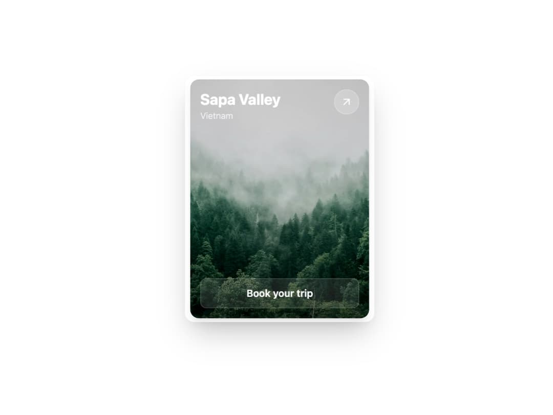
Destination Card – Showcase travel spots. Highlights locations with image, details, and a quick booking option for better trip planning.
Built with React and Tailwind. Copy the prompt and paste it into Claude Code, Cursor or Lovable: your agent adds 3D Card to your project and fits it to your theme.
Code
How 3D Card is used: the demo's code. The component's own source comes with a free account.
Usage.tsx
import { InteractiveTravelCard } from "@/components/ui/3d-card"; // Adjust this import path

export default function InteractiveTravelCardDemo() {
  return (
    // The container uses theme variables and provides perspective for the 3D effect.
    <div className="flex min-h-[30rem] w-full items-center justify-center bg-background p-8">
       <div
        style={{
          perspective: "1000px"
        }}
       >
        <InteractiveTravelCard
          title="Sapa Valley"
          subtitle="Vietnam"
          imageUrl="https://cdn.21st.dev/assets/mirror/cb/cba31f67585cf839050f0f22fbea6a3ba72bed28250b0afd82cf354da4b1e652.jpg"
          actionText="Book your trip"
          href="https://en.wikipedia.org/wiki/Sa_Pa"
          onActionClick={() => {
            alert("This action can be customized via the onActionClick prop.");
          }}
        />
      </div>
    </div>
  );
}
Dependencies
More by Kavi Katiyar
View all

Bento Product Features
831
Testimonial Slider
716
Card
607
Order Confirmation Card
504
Project Detail View
408
State
393
Animated Card
393
Performance Benchmark Card
387
More in Cards
View all

Statistics Card 2
264

Course Design Cards
1.1K
Card
70
Stats cards with links
39
The Item one
3

Card Studio
7
Statistics Card 7
292

Item
10
